
If your mobile app has a drop-off problem, a low retention rate, or users that just seem to get stuck, the answer is almost always hiding in how real people actually use it. Your analytics dashboard alone will not tell you the full story.
That is where mobile app usability testing comes in.
This guide covers what mobile usability testing actually involves, why it is different from testing a desktop website, which methods work best, and how to set up a testing process that gives you actionable insights rather than a pile of observations you do not know what to do with.
Whether you are a product manager, a UX designer, a developer, or a business owner with a mobile app, this is the practical guide you need.
What Is Mobile App Usability Testing?
Usability testing is the process of watching real users attempt to complete tasks within your app, paying close attention to where they struggle, hesitate, make mistakes, or give up entirely.
The goal is not to validate that your app looks good. It is to find out whether people can actually use it to do what they came to do: efficiently, without confusion, and without wanting to throw their phone across the room.
Mobile usability testing specifically focuses on the unique context of smartphone and tablet use: small screens, touch interactions, real-world environments, and the fact that attention is often divided.
Why does it matter for your business?
Poor mobile UX directly impacts your bottom line. High task abandonment rates, low session duration, poor app store ratings, and weak conversion rates are all common symptoms of a usability problem. Fixing these issues does not always require a full app redesign. Often it comes down to a handful of friction points that regular usability testing would surface quickly.
Why Mobile Usability Testing Is Different From Desktop Testing
This is an important point that many teams underestimate. You cannot simply take your desktop usability testing process and apply it to mobile. The context, the interaction model, and the user behavior are fundamentally different.
Here is what makes mobile testing its own discipline:
Touch-based interaction. Users are tapping, swiping, pinching, and scrolling with their fingers rather than clicking with a mouse. Buttons that are too small, interactive elements that are too close together, and gestures that are not intuitive will all create problems that would never appear on a desktop test.
One-handed use. Research consistently shows that a large portion of smartphone users interact with their device using one hand. This affects where elements should be placed on screen, the size of tap targets, and how easily users can reach key actions. This is particularly important for larger phones.
Divided attention. Mobile users are rarely sitting still and fully focused. They are on the bus, waiting in line, half-watching TV. Your app needs to work in those messy, distracted real-world conditions, not just in a controlled lab setting.
Screen size constraints. There is simply less space to work with. Navigation patterns, content hierarchy, and form design all need to be tested specifically for the smaller viewport rather than assumed to translate from desktop.
Variable connectivity. Unlike a laptop on a stable WiFi connection, mobile users deal with fluctuating network speeds. Slow load times and failure states need to be part of your usability considerations.
Device and OS fragmentation. Android and iOS behave differently. Screen sizes vary enormously. What works on an iPhone 17 Pro Max might behave completely differently on a mid-range Android device.
Understanding these differences means your testing setup, your tasks, your recruitment criteria, and your analysis all need to account for the mobile context specifically.
The Core Methods for Mobile App Usability Testing
There is no single right method for testing a mobile app. The best approach depends on your goals, your stage of development, your budget, and how much access you have to your target users. In practice, most strong UX programs use a combination of methods.
1. Moderated In-Person Testing
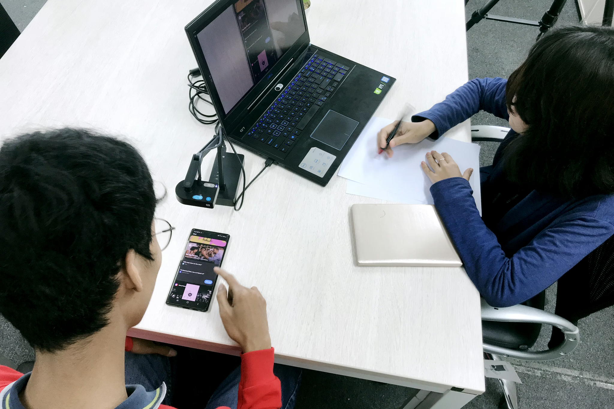
This is the traditional "lab testing" model. You recruit participants, bring them into a room (or a quiet space), ask them to complete tasks on your app, and observe directly what happens.
How it works: A facilitator (or moderator) sits with the participant and guides them through a series of tasks. The participant is usually asked to "think aloud," narrating what they are doing, what they expect to happen, and how they are feeling as they go. Sessions are typically recorded for later review.
What makes it valuable: You get rich, qualitative insight. You can ask follow-up questions in real time. You can observe body language and emotional responses. You can probe when something interesting happens. This method tends to produce the deepest understanding of why a problem exists, not just that it exists.
Mobile-specific consideration: Capturing the screen during in-person mobile testing requires a dedicated setup. Options include mirroring the device to a larger screen or laptop (via tools like Reflector or QuickTime for iOS), using a camera rig mounted above the device, or using a testing tool with built-in mobile screen recording. Do not rely solely on a camera pointing at the phone. The footage is almost always too hard to analyze.
Best for: Exploratory research in early stages, complex interaction flows, or situations where you need to understand user mental models deeply.
2. Moderated Remote Testing
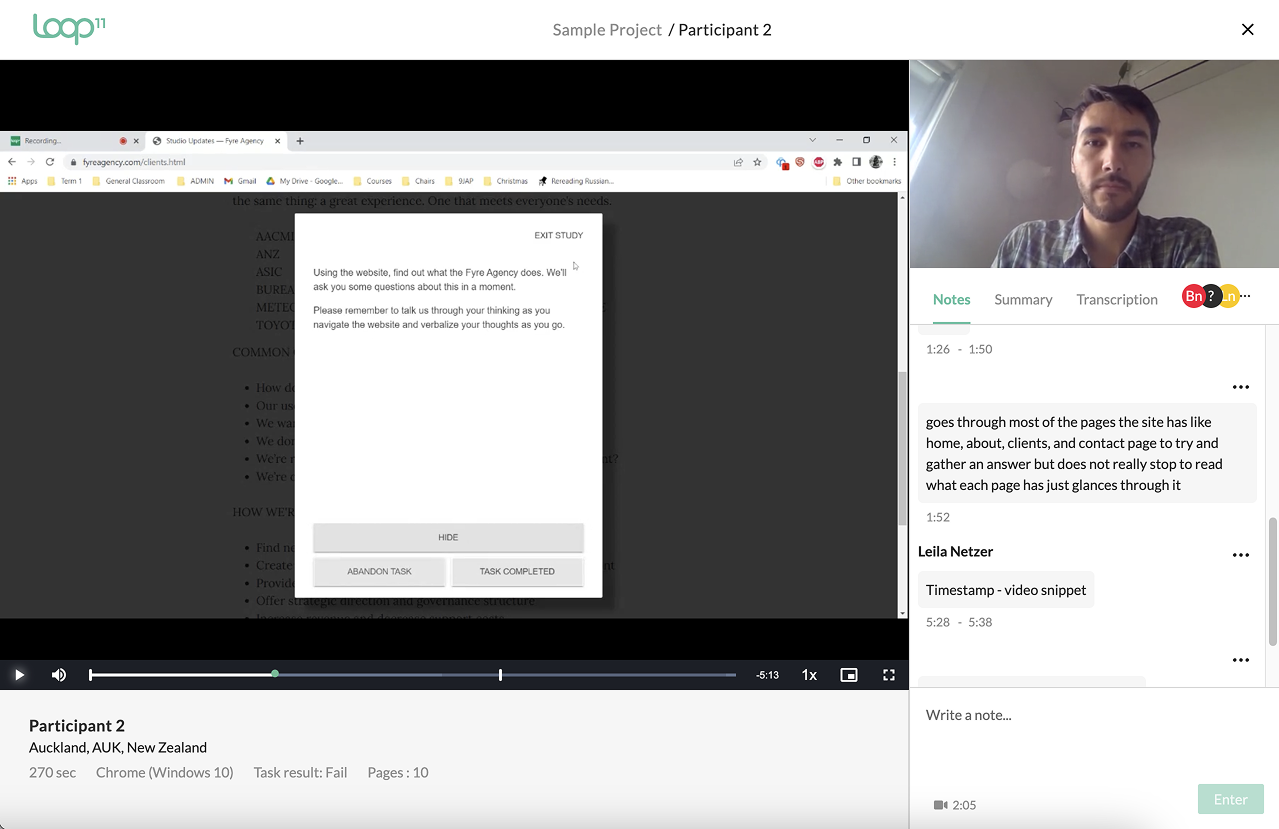
Same principle as in-person, but conducted over video call. The participant uses their own device, in their own environment, and shares their screen while the facilitator observes and asks questions remotely.
How it works: The participant joins a video call (Zoom, Teams, or a dedicated research platform), shares their phone screen, and completes tasks while thinking aloud. The facilitator can see everything in real time and can intervene or probe as needed.
What makes it valuable: You can recruit from anywhere, which makes it far easier to reach your actual target audience. Participants are also in their natural environment, which can surface real-world behaviors you would never see in a lab. For example, you might observe how they use the app while holding a coffee cup, or while being interrupted.
Mobile-specific consideration: Screen sharing from a mobile device via video call can be technically fiddly for participants. Always run a tech check before the session starts and have a backup plan. Some platforms (like UserZoom or Lookback) have dedicated mobile apps that simplify this significantly.
Best for: Remote or geographically distributed user bases, naturalistic observation, or when budget does not allow for in-person sessions.
3. Unmoderated Remote Testing
In this model, participants complete tasks on their own, without a facilitator present. They record their screen and voice (and sometimes their face via front camera), and you review the recordings afterward.
How it works: You set up a study through a platform like UserTesting, Maze, or Userbrain. Participants are sent a link, they complete the tasks in their own time, and you receive recordings and any quantitative data (task completion rates, time-on-task, etc.) once they are done.
What makes it valuable: It scales well. You can run studies with larger sample sizes more quickly and at lower cost than moderated testing. The turnaround time is fast. You can often have results within 24 to 48 hours.
Mobile-specific consideration: You have less control over the environment, the device being used, and whether participants genuinely engage with the tasks. Writing clear, unambiguous task scenarios is critical. Vague or leading tasks produce unusable data. Also be aware that some platforms have a stronger panel of participants for desktop testing than mobile. Verify this before committing to a platform.
Best for: Validation testing, benchmarking against a previous version, testing specific flows or interactions at speed, or supplementing moderated research with a larger sample.
4. Guerrilla Testing
Guerrilla testing is informal, fast, and cheap. You take your app out into the real world (a coffee shop, a coworking space, a shopping center) and ask strangers or colleagues to spend five to ten minutes using it while you observe.
What makes it valuable: It is a great way to get quick, honest feedback in the early stages of design. It keeps you from getting too locked into your own assumptions. And it costs almost nothing.
Mobile-specific consideration: Because you are handing your device to a stranger, make sure sensitive data and accounts are cleared out. Also keep tasks short and focused. Guerrilla sessions rarely run longer than 10 minutes before participants lose interest or patience.
Best for: Early-stage concept validation, quick gut-checks between design iterations, or when budget is extremely limited.
5. Contextual Inquiry
Contextual inquiry takes usability research out of the testing room entirely. You observe and interview users in their actual environment, the place where they would naturally use the app, to understand their real-world context, habits, and needs.
What makes it valuable: For mobile apps especially, the context of use matters enormously. A banking app might be used in a branch, on public transport, or in a moment of financial stress. A fitness app might be used mid-workout, with sweaty hands, in low light. Understanding that context shapes better design decisions.
Best for: Discovery research, understanding user journeys, designing for specific real-world scenarios.
6. Benchmarking and Task-Based Metrics
Beyond observational methods, it is valuable to measure usability quantitatively over time. Benchmarking involves running standardized tasks with a representative sample of users and measuring metrics like:
- Task completion rate (the percentage of users who successfully complete a task)
- Time on task (how long it takes to complete)
- Error rate (how many mistakes users make along the way)
- System Usability Scale (SUS) scores: a standardized 10-question survey that gives a usability score out of 100
Mobile-specific consideration: SUS scores and task metrics are only meaningful if you are consistent in how you measure them. Establish your baseline early and repeat the same study at regular intervals to track improvement over time.
Best for: Tracking UX improvement across product versions, comparing your app against competitors, or making a business case for UX investment.
How Many Users Do You Actually Need?
This is one of the most common questions in usability testing. The research from Jakob Nielsen (widely cited in UX circles) suggests that 5 users is enough to uncover approximately 85% of usability problems in qualitative testing.
That said, five users works well for moderated, qualitative testing where you are looking for patterns in behavior. If you are running quantitative benchmarking (measuring task completion rates to a statistically meaningful level), you will need more. Typically that means 20 to 30 participants at a minimum, depending on the level of confidence you need.
The practical answer: start with 5 users per key user segment, synthesize what you find, make changes, and test again. Usability testing is most valuable as an ongoing, iterative process, not a one-time event before launch.
Recruiting the Right Participants
Your test is only as good as the people you test with. Recruiting the wrong participants (people who do not represent your actual users) will produce findings that are interesting but not actionable.
Define your user profile first. Before you recruit, document who your target user actually is. Consider demographics, digital literacy level, device type, and how frequently they would use the app. If your app has multiple distinct user types, make sure your recruitment covers them.
Avoid recruiting people who already know your product. Existing power users have learned to work around your UX problems. They are not representative of new or casual users, and they will not notice the friction that trips people up on day one.
Screen participants carefully. Use a screener questionnaire to filter for the right profile. Ask about device usage, relevant behaviors, and experience with similar apps. Be specific.
Compensate participants fairly. Paid participants show up, complete tasks properly, and give honest feedback. Uncompensated studies tend to attract a skewed sample: people who are unusually enthusiastic or who have an axe to grind.
Writing Good Task Scenarios
This is an area where many teams go wrong and do not realize it. Poorly written tasks produce poor data.
Do not tell users what to do. Tell them why they want to do it. Instead of "Find the settings page and change your notification preferences," try: "You have been getting too many notifications from the app and you want to reduce them. Show me what you would do."
The first version tells users where to go, which bypasses the navigation problem you are trying to uncover. The second version gives them a realistic goal and lets you observe whether they can actually achieve it.
Keep tasks realistic and grounded in genuine user goals. Base them on real use cases, support tickets, or behavioral data. Not on a list of features you want to validate.
Avoid leading language. Do not use the names of UI elements in the task (like button labels or menu names), as this directs users to the answer rather than letting you observe how they find it.
Mobile-Specific UX Issues to Watch For
When you are analyzing your mobile usability sessions, these are the common problem areas that tend to surface:
Tap target size. Apple's Human Interface Guidelines recommend a minimum tap target of 44x44 points. Google's Material Design recommends 48x48dp. In practice, many apps have buttons and links that are far smaller than this, leading to mis-taps and frustration.
Navigation complexity. On mobile, deep navigation hierarchies are a serious problem. Users get lost quickly if they cannot easily understand where they are and how to get back. Watch for users who get stuck in a flow they cannot exit.
Form friction. Forms on mobile are painful if designed poorly. Long forms, inputs that trigger the wrong keyboard type, lack of autofill support, and poor error messaging are all common problems that kill conversion rates.
Gesture discoverability. Swipe-based interactions and other gestures are powerful, but users will not use them if they do not know they exist. If your app relies heavily on gestures, test specifically whether users discover and understand them.
Onboarding clarity. First impressions on mobile are critical. A confusing onboarding flow is one of the most common reasons users abandon an app permanently within the first session. Test your onboarding with new users who have never seen the app before.
Loading and performance perception. Even if load times are technically acceptable, users perceive apps as slow if there is no visual feedback (a spinner, a skeleton screen, a progress indicator). Test how users respond to loading states, not just happy-path flows.
Turning Usability Test Findings Into Action
Testing without acting on what you find is a wasted exercise. Here is a simple framework for moving from findings to improvements:
Step 1: Synthesize across sessions. After completing your sessions, identify patterns. A problem that one participant experiences might be an edge case. A problem that four out of five participants hit is a real issue that needs to be addressed.
Step 2: Severity rate your findings. Not all usability problems are equal. Prioritize based on two factors: frequency (how many users encountered this?) and impact (how badly did it affect their ability to complete the task?). A quick 2x2 matrix (severity vs. effort to fix) helps communicate priorities to developers and stakeholders.
Step 3: Generate hypotheses, not just fixes. Each finding should inform a hypothesis: "Users are abandoning the checkout flow because they do not understand what the address field is asking for. If we add inline helper text, more users will complete the form." This framing sets you up for proper A/B or MVT testing of your solutions.
Step 4: Test the fix, do not assume it worked. Once you have shipped changes based on usability findings, validate the improvement. This might mean another round of usability testing, or it might mean A/B testing the change against the original and measuring conversion impact.
How Often Should You Be Testing?
The answer most teams do not want to hear: more often than you currently are.
Usability testing is not a one-time pre-launch activity. The most effective product teams build testing into their regular workflow. A common cadence is one round of testing per sprint or per major feature release, keeping sessions lean (5 users, 45 to 60 minutes each) so the overhead stays manageable.
At a minimum, test at these key moments:
- Before a major new feature ships
- After a significant redesign
- When you see a spike in drop-off rates or support tickets
- When you are considering a major navigation or flow change
- Periodically as a routine health check, even when no specific changes are planned
Regular testing means problems get caught early, when they are cheap to fix, rather than after they have been shipped to hundreds of thousands of users.
Frequently Asked Questions About Mobile Usability Testing
How is mobile usability testing different from regular usability testing? Mobile testing accounts for touch-based interaction, smaller screen real estate, one-handed use, real-world distracted environments, and device/OS fragmentation. The methods are similar, but the setup, tasks, and findings will reflect these mobile-specific considerations.
How much does mobile usability testing cost? It varies widely. A DIY unmoderated study using a tool like Maze or Userbrain can cost as little as a few hundred dollars. A professional moderated study with recruitment, facilitation, and analysis typically runs from a few thousand to tens of thousands of dollars depending on scope and user profile complexity.
Do I need a finished app to run usability testing? No. You can test at every stage of development, from paper prototypes and clickable wireframes through to live production builds. Testing earlier catches problems when they are cheapest to fix.
How do I get my app in front of test participants? Options include TestFlight (iOS), Android beta testing via the Google Play Console, or simply handing your device to a participant during an in-person session. For remote testing, many platforms support direct URL-based prototype testing or app store beta links.
What is a good usability score? If you are using the System Usability Scale (SUS), a score above 68 is considered above average. Scores above 80 are considered good to excellent. Industry benchmarks vary by category, so it is worth comparing against competitors in your specific space.
Final Thoughts
Mobile app usability testing is not a luxury reserved for large product teams with dedicated UX researchers. It is one of the highest-return activities any team can invest in, because the insights you get from watching real users navigate your app are worth more than any amount of stakeholder opinion or internal debate about what users might want.
The methods in this guide range from quick and cheap (guerrilla testing, unmoderated studies) to thorough and detailed (moderated sessions, contextual inquiry). The right approach depends on your questions, your stage, and your resources. But the most important thing is simply to start and to keep doing it.
Ready to Improve Your Mobile App's User Experience?
If you are seeing signs that your mobile app has usability problems (low conversion rates, high drop-off, poor retention, or frustrated user reviews) we can help you find out exactly what is going wrong and how to fix it.
Book a free consultation with our UX team. We will take a look at your current setup, discuss your goals, and map out a usability research plan that is practical, cost-effective, and tied to real business outcomes.
Book a Free Website Consultation
Discover quick wins for your digital strategy. 100% guaranteed.