If you run a SaaS product, you already know the business model works differently than most. You are not selling a one-time purchase. You are selling ongoing value, and every login is a chance for the user to decide whether your product is still worth their time (and their monthly subscription fee).
This is exactly why UI design matters so much in SaaS. A confusing interface does not just create a bad first impression, it actively drives up churn, increases support tickets, and slows down user adoption of the features you built to keep people around. Good UI design, on the other hand, quietly does a lot of heavy lifting: it reduces the learning curve, builds trust, and makes users feel capable rather than lost.
In this guide, we will break down what makes SaaS UI design different from other types of digital products, the core principles to get right, and practical strategies you can apply whether you are building a new product or improving an existing one.
Why UI Design Is Different for SaaS Products
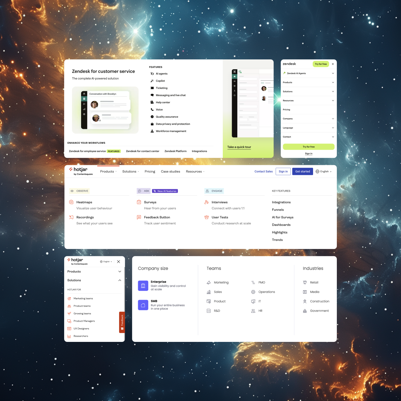
Most UI design advice online is generic. It applies fine to marketing websites or ecommerce stores, but SaaS products have their own set of challenges that make good UI design harder, and more important, to get right.
A few things set SaaS apart:
- Users return again and again. Unlike a one-off purchase, SaaS interfaces need to hold up under repeated, daily use. Small annoyances that seem minor on a single visit become genuinely frustrating on the fiftieth visit.
- Complexity is often unavoidable. SaaS products tend to solve complex problems (project management, data analysis, finance, HR), which means the UI has to make complex workflows feel simple without stripping away the functionality that makes the product valuable.
- Onboarding determines survival. In SaaS, users typically self-select into a free trial or freemium plan. If the interface does not help them reach value quickly, they leave before ever becoming a paying customer.
- Retention is the real KPI. SaaS revenue depends on subscriptions renewing, not just signing up. UI design has a direct line to reducing churn because it shapes how easy or hard it is for users to keep getting value.
Understanding these differences is the starting point for building UI strategies that actually move the needle on user satisfaction and retention.
Core Principles of Effective SaaS UI Design
Prioritize Clarity Over Cleverness
SaaS users are often busy professionals trying to get a job done, not browsing for entertainment. Overly creative or unconventional UI patterns might look impressive in a portfolio, but they slow users down in daily use. Stick to familiar patterns (standard navigation placement, recognizable icons, consistent button styles) unless you have a strong, tested reason to deviate. For a deeper look at the fundamentals, see our guide on principles of effective UI design.
Design for Progressive Disclosure
Most SaaS products have more features than any single user needs on day one. Progressive disclosure means showing users only what is relevant to their current task, and revealing advanced options as they need them. This keeps the interface approachable for new users while still supporting power users who want deeper functionality.
Build a Strong Information Hierarchy
In data-heavy SaaS products (think dashboards, reporting tools, or CRMs) information hierarchy is what separates a usable product from an overwhelming one. Use size, color, spacing, and grouping to guide the eye toward what matters most first: key metrics, primary actions, and anything requiring the user's immediate attention. Typography plays a bigger role here than most teams realize; see our guide on typography in UI design for how font choice and pairing support hierarchy.
Design Consistent, Predictable Patterns
Consistency reduces cognitive load. If a button style, icon, or interaction pattern means one thing on one screen, it should mean the same thing everywhere else in the product. Design systems (a shared library of components, styles, and rules) are one of the most effective tools SaaS teams use to maintain this consistency as the product scales. Color plays a big part in this too, our piece on color theory in UI design covers how to use color systematically rather than decoratively.
Make Empty States and Errors Useful
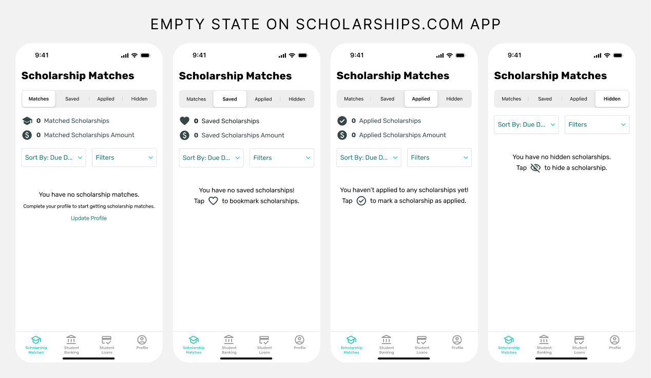
Empty states (a dashboard with no data yet, a search with no results) and error states are chances to guide the user rather than dead ends. Instead of a blank screen or a generic "Something went wrong" message, use these moments to explain what happened and suggest a next step.
UI Strategies That Improve SaaS User Satisfaction
1. Streamline Onboarding
The first few minutes in your product often determine whether a trial user becomes a paying customer. Effective SaaS onboarding UI typically includes:
- A short, skippable product tour focused on core value, not every feature
- Progress indicators so users know how much setup is left
- Empty states that prompt the next action instead of leaving users guessing
- Contextual tooltips introduced at the moment they are relevant, not all at once
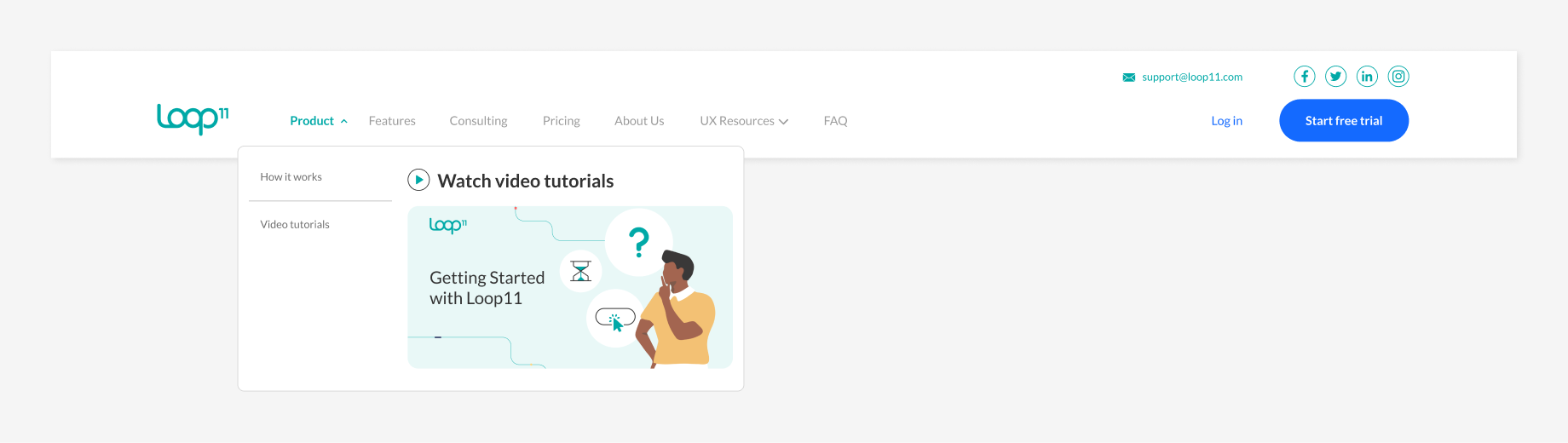
This is an area where small UI decisions have an outsized impact. In our case study on improving user onboarding and SEO through video tutorials for Loop11, we walk through how pairing UI improvements with contextual video content helped new users reach value faster.
2. Design Dashboards Around User Goals, Not Just Data
It is tempting to cram every available metric onto a dashboard. Instead, design around the two or three things a user needs to check most often. You can always let users customize or drill into additional data, but the default view should answer "what do I need to know right now" without extra clicks.
3. Reduce Friction in Core Workflows
Map out the core workflows your users repeat most often (creating a project, sending an invoice, generating a report) and audit every step for unnecessary friction. Ask: does this field need to be here? Can this be pre-filled? Can this be a default setting instead of a decision the user has to make? Navigation is often where friction hides in plain sight, our guide on optimizing your website's navigation menu applies just as well inside a SaaS product as it does on a marketing site.
4. Use Microinteractions to Provide Feedback
Small, subtle animations and feedback cues (a checkmark after saving, a progress bar during upload, a gentle color change when a form field is validated) reassure users that the product is responding to their actions. In SaaS, where users often perform repetitive tasks, this kind of feedback builds trust and confidence over time.
5. Design for Accessibility From the Start
Accessible UI design (sufficient color contrast, keyboard navigation, screen reader support, readable font sizes) is not just a compliance checkbox. It expands your addressable market and often improves usability for all users, not just those with disabilities. Our guide on website accessibility covers the key standards and legal considerations every product team should know.
6. Keep Navigation Simple as the Product Grows
As SaaS products mature, it is common for navigation menus to become cluttered with every new feature added over time. Regularly revisit your information architecture and navigation structure to make sure it still reflects how users actually think about and use the product, not just how the engineering team built it. If your product has grown to the point where a mega menu is on the table, weigh it up first with our breakdown of SaaS mega menu best practices and the mega menu pros and cons.
Common SaaS UI Design Mistakes to Avoid
- Feature creep without UI updates. Adding new features without revisiting the overall interface leads to cluttered, confusing products over time.
- Ignoring returning users. Designing only for the "first five minutes" experience while neglecting the day-to-day experience of long-term users.
- Inconsistent design patterns. Different teams building different parts of the product without a shared design system, leading to a disjointed experience.
- Overloading users with options. Giving users too many settings or configuration choices upfront, rather than sensible defaults with the option to customize later.
- Skipping user testing. Making UI decisions based on internal opinions or assumptions rather than actual user behavior and feedback. Skipping this step tends to cost far more down the line than it saves upfront.
How to Know If Your SaaS UI Needs Improvement
A few signs that it may be time to revisit your UI design:
- High drop-off rates during onboarding or trial periods
- Frequent support tickets about "how do I do X"
- Low adoption of features that are actually useful for the user
- Negative feedback specifically about the product feeling "confusing" or "cluttered"
- Increasing churn without a clear pricing or competitive explanation
If any of these sound familiar, running structured usability testing and analyzing behavioral data are good next steps before making design changes based on guesswork alone.
Real SaaS UI Design in Action
Some proof it works in practice:
- Redesigning the Total Coach App Experience, a look at how a full UI redesign improved usability for a SaaS coaching platform
- Designing SEO-Optimized New Feature Pages for Loop11 Platform, showing how UI decisions on feature pages supported both usability and organic growth
- Improving Email Engagement for Loop11's Free Trial Users, an example of how onboarding and lifecycle touchpoints work alongside in-product UI to convert trial users
Final Thoughts
UI design for SaaS products is not about making things look polished for the sake of it. It is about reducing friction, building trust, and helping users get to value faster and more consistently every time they log in. When done well, it becomes one of your most effective (and most overlooked) levers for improving retention and reducing churn.
The SaaS products that win long-term are usually not the ones with the most features. They are the ones that make using those features feel effortless.
Not sure where your SaaS product's UI is falling short? Book a free consultation with our team and we'll help you identify quick wins and long-term improvements to boost user satisfaction and retention.
Book a Free Website Consultation
Discover quick wins for your digital strategy. 100% guaranteed.