


About the Project:
Scholarships.com is a leading platform connecting students with financial aid opportunities. Following our website redesign and CRO work for Scholarships.com, the team was brought back to design a dedicated mobile app – a focused, student-first experience built around the actions that matter most: finding scholarships, tracking applications, and exploring partner offerings for student banking and loans.
Live site: scholarships.com
Mission:
Our objective was to design a streamlined mobile app version of the Scholarships.com platform, focusing on core user actions rather than replicating the full desktop experience. Key goals included:
- Designing a smooth account registration flow tailored to new student users.
- Surfacing personalized scholarship matches quickly and intuitively.
- Building a clear system for tracking application progress.
- Integrating dedicated sections for partner offerings in student banking and student loans.
- Creating a simple, mobile-first experience that feels approachable and relevant to a younger audience.
Process:
To uncover insights and optimization opportunities, we followed a structured CRO methodology:
- Wireframing: We began by mapping out the required screens and user flows for all core app features. This ensured the structure clearly supported account creation, scholarship browsing, application tracking, and partner sign-ups before any visual design work began.
- Design & Iteration: With wireframes approved, we moved into high-fidelity design in Figma. We iterated on layouts and interactions to create a streamlined, mobile-first experience aligned with the Scholarships.com brand, balancing visual appeal with ease of use for students on the go.
- Developer Handoff: We prepared organized Figma files and thorough documentation for a smooth handoff to developers, ensuring components, spacing, and interactions were clearly specified and ready to build.
Solution:
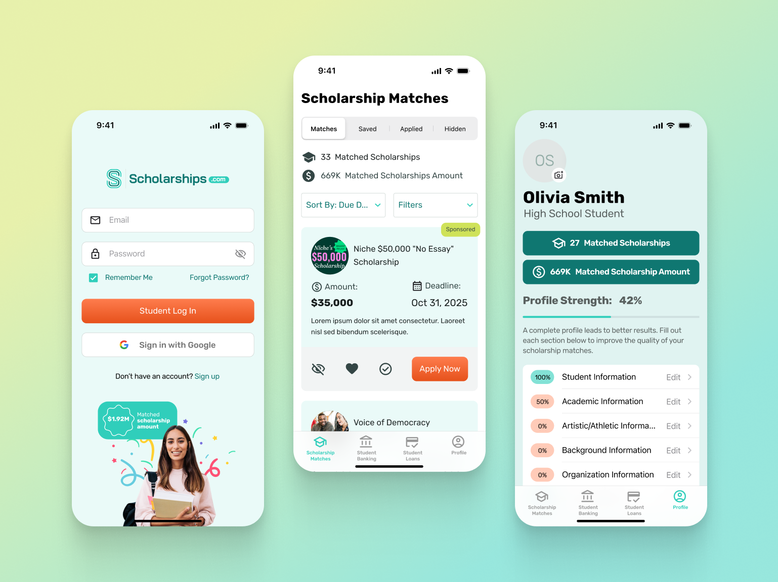
Scholarship Matches
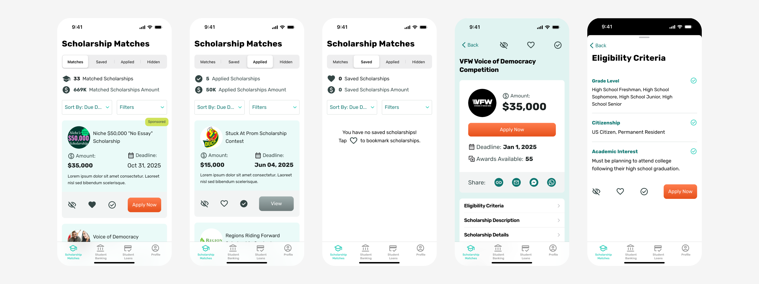
The app was intentionally designed as a simplified version of the desktop experience. Some advanced features, such as search and category browsing, were removed to keep the app focused and easy to use. Instead, the design prioritizes quick access to the four most important scholarship states:
- Matches: scholarships the student qualifies for
- Saved: scholarships bookmarked for later
- Applied: scholarships with a submitted application
- Hidden: scholarships the student has dismissed
This streamlined navigation allows students to easily manage their scholarships and track application progress without feeling overwhelmed.
Utility Pages
These pages were redesigned to align with the new Scholarships.com homepage and improve usability on mobile.
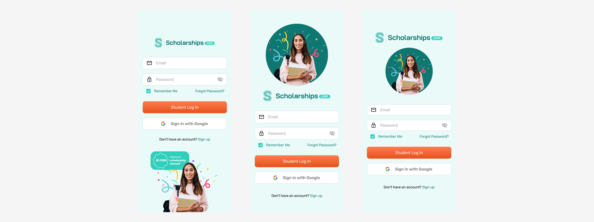
Login Page
Updated styling to match the refreshed website branding. Added a "Remember Me" option so students can stay logged in on their personal devices without having to re-authenticate each visit.
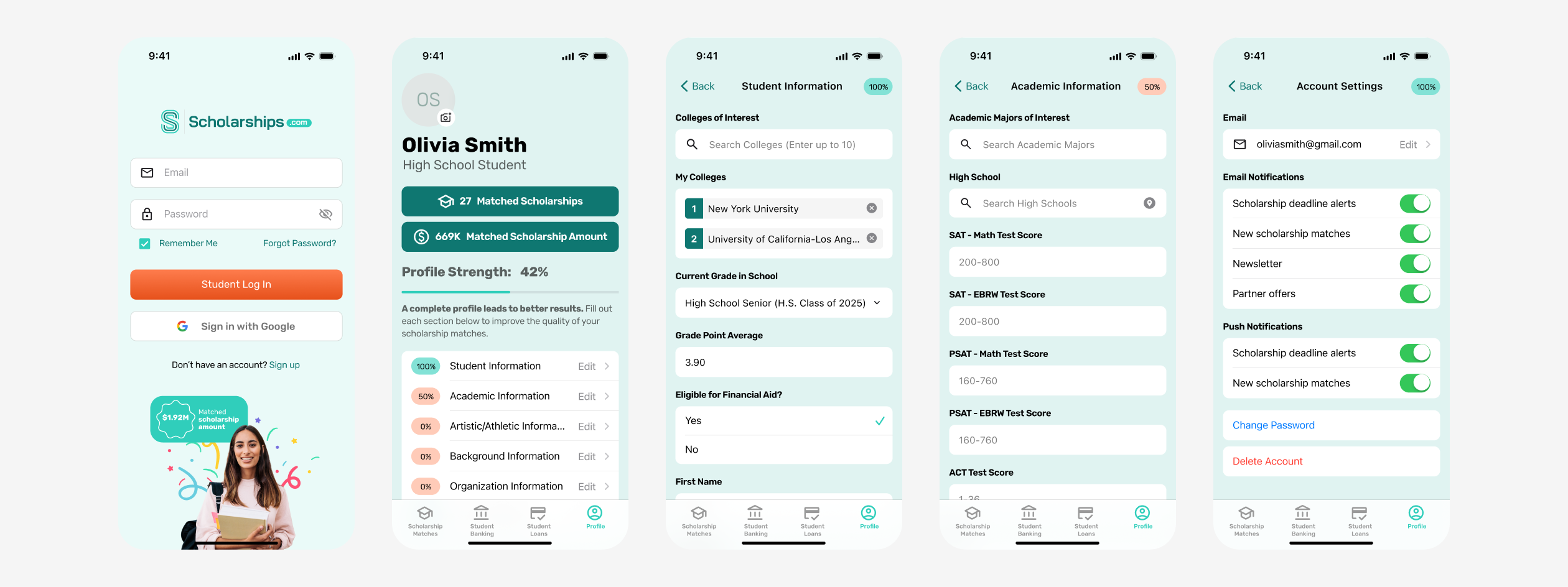
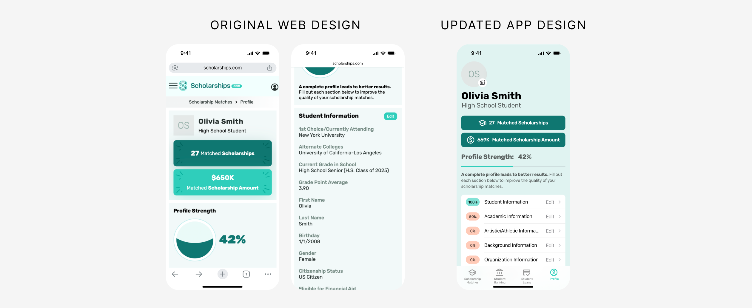
Profile Dashboard
Redesigned the profile overview to be more compact and scannable. The large circular progress graphic from the original site was replaced with a horizontal progress bar, allowing more information to be visible without scrolling. Progress indicators were added for each profile section, including Student Info and Academic Info, so users can quickly identify which areas still need to be completed.
Profile Navigation
On the original mobile site, every profile section was displayed fully expanded, resulting in excessive scrolling. In the app, sections were redesigned as menu items that each open into a dedicated screen. This allows users to see their entire profile structure at a glance and navigate directly to the section they need.
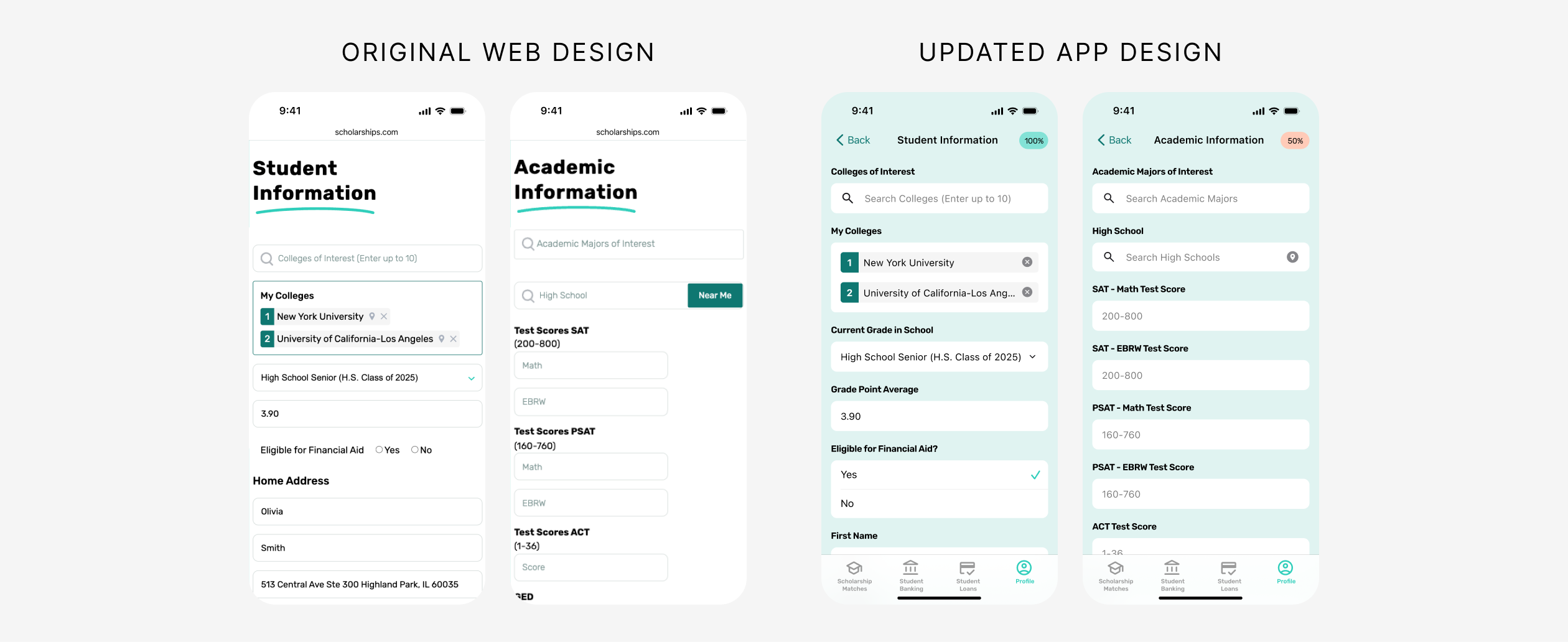
Profile Forms
Persistent field labels were added to every input. Previously, fields relied only on placeholder text, which disappeared as soon as users began typing, making it difficult to distinguish between similar fields such as SAT Math Score and SAT EBRW Score. Small radio buttons were also replaced with larger Apple-style selection controls to improve tap targets and accessibility.
Account Settings
Email and push notification toggles were added so users can control how they receive scholarship updates and alerts, putting notification preferences directly in their hands.
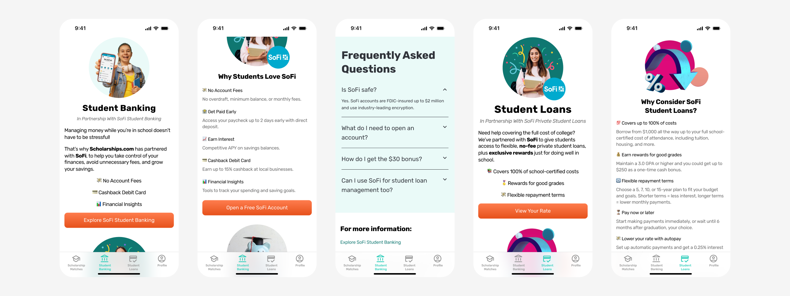
Student Banking & Student Loans
Two dedicated tabs were created to support the client's partner offerings. These pages provide an overview of each partner service and encourage students to sign up. Key design decisions included:
- Reusing visual elements and imagery from the main website to reinforce brand consistency across platforms.
- Breaking content into short, scannable sections designed for comfortable mobile reading.
- Using emojis and visual markers to add personality and appeal to a younger student audience.
- Including FAQ sections to provide reassurance and build trust around important financial decisions.
Conclusion
By designing a purpose-built mobile app rather than simply adapting the desktop site, we were able to create a focused, intuitive experience that puts the most important student actions front and center. From a simplified scholarship dashboard to accessible profile forms and partner-integrated tabs, every screen was designed with the student user in mind, keeping the experience clear, approachable, and easy to navigate.
Ready to Bring Your App Idea to Life?
If you're looking to design a mobile experience that's intuitive, on-brand, and built for your users, KARL Mission can help. Book a free consultation and let's talk about how great design can move your product forward.
Book a Free Website Consultation
Discover quick wins for your digital strategy. 100% guaranteed.

