If your product pages are not converting the way you want, you are probably not alone. The average ecommerce product page converts at around 2 to 3 percent. That means for every 100 people who land on your product detail page (PDP), 97 or more leave without buying.
The good news? A/B testing gives you a reliable, data-backed way to close that gap. Not by guessing, not by copying what a competitor is doing, but by running controlled experiments on your own audience and letting the results tell you what works.
This guide covers specific A/B testing strategies for ecommerce product pages, what elements are worth testing, how to prioritize your experiments, and what best practices actually hold up in the real world.
What Is A/B Testing on a Product Page?
A/B testing (also called split testing) is the process of showing two or more versions of a web page to different segments of your traffic at the same time, then measuring which version drives more of a desired action, such as adding to cart, clicking "Buy Now," or completing a purchase.
On a product detail page, this could be as simple as testing two different button colors or as complex as testing an entirely restructured page layout.
The key principle is this: you change one thing at a time (in a standard A/B test), measure the result against your baseline, and make decisions based on statistically significant data, not gut feel.
Why Product Pages Are One of the Best Places to Start Testing
Product pages sit right at the bottom of your conversion funnel. A visitor who lands on a product page has already shown purchase intent. They are browsing, evaluating, and considering. Any friction or confusion at this stage is directly costing you revenue.
Even small lifts in conversion rates on high-traffic product pages can have a significant impact on total revenue. A 0.5 percent improvement on a page generating $500,000 in revenue per month is worth $2,500 monthly or $30,000 per year, without spending a cent more on traffic.
That is the power of CRO applied specifically to product pages.
Before You Test: Build a Strong Hypothesis
Random testing wastes time and budget. Before running any experiment, you should define a clear hypothesis.
A good hypothesis follows this structure:
"We believe that [change] will result in [outcome] because [reason based on data or user behavior]."
For example: "We believe that replacing the text CTA with a high-contrast button containing urgency language will increase add-to-cart rate because heatmap data shows users are not engaging with the current CTA."
Your hypotheses should be rooted in one or more of the following:
- Quantitative data from your analytics platform (drop-off points, scroll depth, click maps)
- Qualitative data from user testing sessions, on-site surveys, or customer reviews
- Heuristic analysis based on known UX and CRO best practices
- Customer feedback indicating confusion, hesitation, or missing information
Without a strong hypothesis, you are just throwing things at the wall.
The Top A/B Testing Strategies for Ecommerce Product Pages
Here are the highest-impact elements to test on your product detail pages, with specific ideas for each.
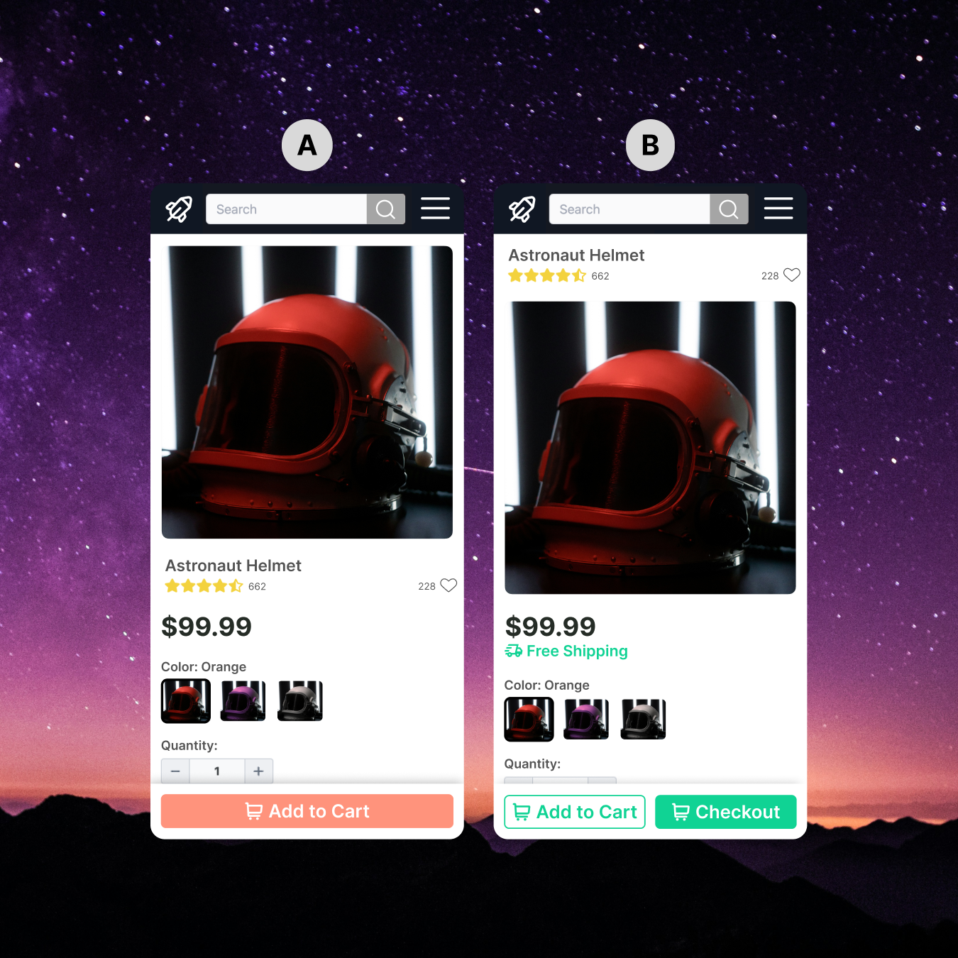
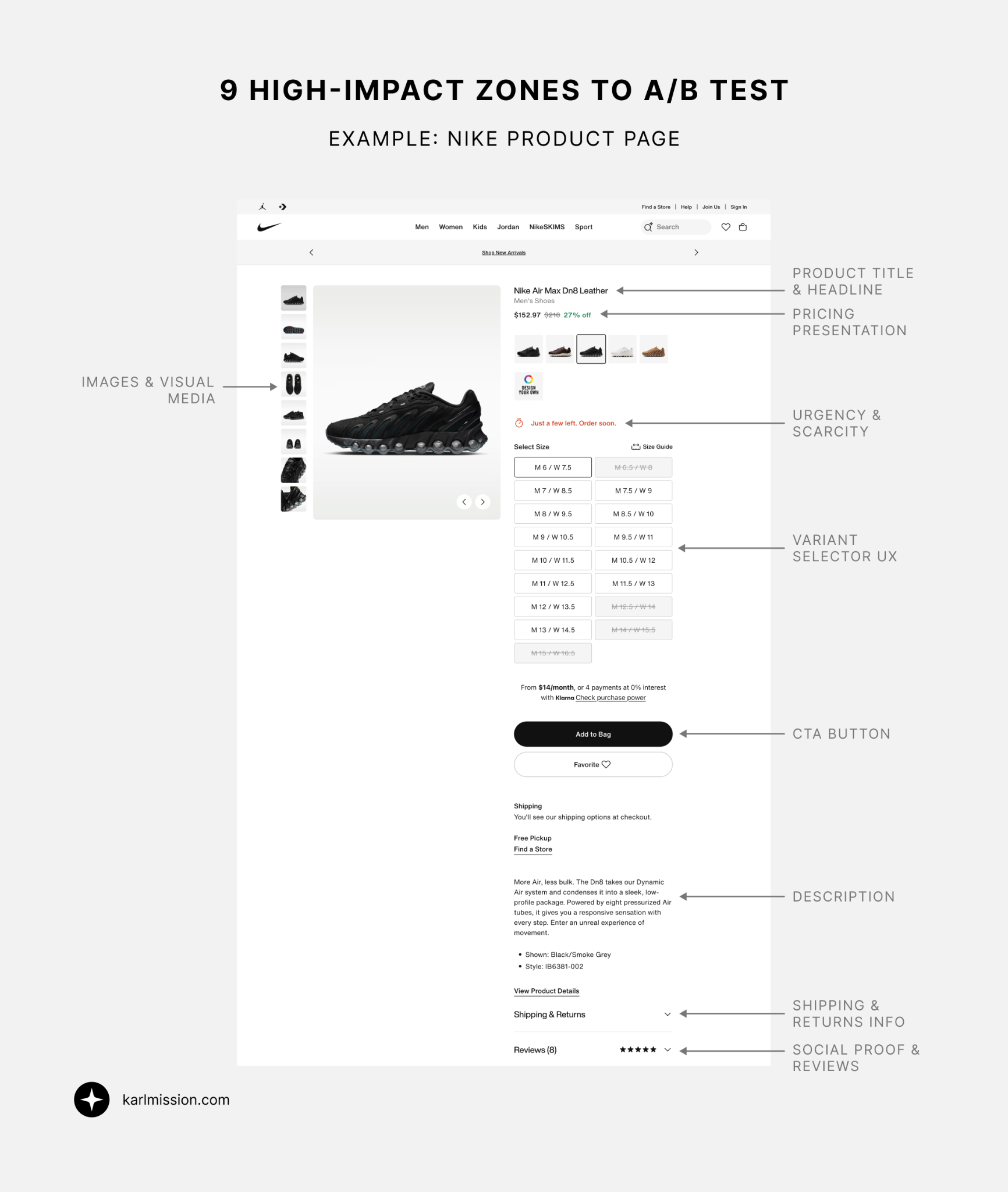
1. The Primary Call to Action (CTA)
The CTA is arguably the single most important element on any product page. It is what turns a browser into a buyer.
What to test:
- Button copy: "Add to Cart" vs. "Buy Now" vs. "Get Yours Today" vs. "Add to Bag"
- Button color and contrast: High-contrast options (e.g., a bold orange or green on a neutral background) often outperform low-contrast ones, but this varies by brand
- Button size and placement: Sticky add-to-cart buttons that follow the user as they scroll frequently perform well on mobile
- Single vs. multiple CTAs: Some pages benefit from a primary CTA plus a secondary one ("Save for Later" or "Add to Wishlist") while others convert better with a single clear action
- Urgency in the CTA: "Add to Cart" vs. "Add to Cart - Only 3 Left"
What to watch for: CTA tests tend to show results quickly because they sit directly on the conversion path. Even small copy changes can produce meaningful lifts.
2. Product Images and Visual Media
Shoppers cannot touch, feel, or try your product before buying. Your product imagery is doing a lot of the heavy lifting to build trust and reduce purchase anxiety.
What to test:
- Hero image type: Lifestyle images (product in use, in context) vs. clean studio shots against a white background
- Number of images: More images vs. a curated set (too many can overwhelm)
- Image order: Which image appears first can significantly affect first impressions
- Video inclusion: A short product video or 360-degree view vs. static images
- User-generated content (UGC): Integrating real customer photos alongside professional shots
- Zoom functionality: Standard hover-to-zoom vs. a full lightbox experience
Why this matters: Research consistently shows that high-quality, contextual imagery reduces uncertainty and increases purchase confidence, particularly for fashion, home goods, and lifestyle products.
3. Product Title and Description Copy
The words on your product page do more than inform. They persuade, reassure, and convert.
What to test:
- Headline format: Feature-led ("Water-Resistant Hiking Boot") vs. benefit-led ("Stay Dry on Any Trail")
- Description length: Short punchy descriptions vs. detailed long-form copy
- Description format: Bullet points vs. paragraphs vs. a hybrid
- Tone of voice: Technical and precise vs. conversational and aspirational
- Benefits vs. features: Leading with what the product does for the customer vs. what the product is
- Scannability: Bolded key phrases, subheadings, or icon-led feature lists vs. a plain text block
Pro tip: Your customer reviews are a goldmine for copy testing. Pull exact phrases customers use to describe what they love about the product and work them into your descriptions. This is called "voice of customer" copywriting and it consistently outperforms internally written copy.
4. Pricing Presentation and Trust Signals
How you display price can influence perceived value just as much as the price itself.
What to test:
- Price anchoring: Showing the original price crossed out next to a sale price
- Price formatting: $49.99 vs. $50 vs. $49 (research suggests removing the cents sign can make prices feel lower)
- Installment options placement: "Or 4 payments of $12.50 with Afterpay" shown prominently vs. buried below the fold
- Savings messaging: "Save $20" vs. "40% Off" vs. no savings callout
- Price guarantee badges: "Best Price Guarantee" or "Price Match Promise" near the price
- Free shipping threshold messaging: "You're $15 away from free shipping" placed near the CTA
5. Social Proof and Reviews
Trust is one of the biggest barriers to conversion for first-time buyers, and social proof is your most powerful tool to address it.
What to test:
- Review display location: Reviews displayed close to the CTA vs. below the fold
- Star rating visibility: Large, prominent star rating near the top of the page vs. standard placement
- Review summary vs. full reviews: A highlighted "customers love this because..." snippet vs. a full review carousel
- Review count: Showing total review count prominently vs. just the star rating
- Review type: Text-only reviews vs. reviews with customer photos
- Third-party trust badges: Norton, McAfee, or verified purchase seals near the CTA
- "X people are viewing this right now" social proof notifications (use carefully, as these can feel manipulative if overused)
6. Product Variants and Selection UX
For products with multiple colors, sizes, or options, how users select variants has a big impact on conversion.
What to test:
- Swatch style: Color swatches (visual) vs. dropdown selector vs. clickable buttons for size/color
- Out-of-stock messaging: Grayed-out sold-out variants vs. removing them entirely vs. showing them with a waitlist option
- Variant imagery: Updating the hero image dynamically when a color/variant is selected vs. static imagery
- Size guide placement: A size guide link in the variant selector area vs. a pop-up vs. a dedicated page
Why it matters: If users cannot easily find or select the variant they want, they will leave. Friction in the selection process is a significant and often overlooked conversion killer.
7. Page Layout and Content Hierarchy
Sometimes the issue is not any individual element but how the page is organized overall.
What to test:
- Above-the-fold content: What information is visible without scrolling (price, CTA, key benefits)
- Two-column vs. stacked layout: Classic two-column PDP (image left, details right) vs. a full-width stacked design on mobile
- Sticky CTA bars: A floating "Add to Cart" bar that sticks as the user scrolls vs. no sticky element
- Tab-based vs. accordion product info: Organizing specs, shipping info, and FAQs in tabs vs. expandable accordions vs. a single long scroll
- Related products placement: Upsell and cross-sell sections above vs. below the fold, or removed altogether
8. Urgency and Scarcity Signals
When used ethically, urgency and scarcity elements can reduce hesitation and accelerate decision-making.
What to test:
- Low stock messaging: "Only 4 left in stock" near the CTA
- Countdown timers: "Order in the next 2 hours for same-day dispatch" (only use if this is genuinely true)
- Seasonal urgency: "Order by December 20 for Christmas delivery"
- Wishlist prompts as a soft CTA: "Not ready to buy? Save it before it sells out"
Important note: Fake urgency and manufactured scarcity are widely recognized by consumers and will backfire. Only use these elements when they reflect real inventory or real deadlines.
9. Shipping and Returns Information
Unexpected shipping costs and unclear return policies are among the top reasons shoppers abandon product pages.
What to test:
- Free shipping messaging: Displaying free shipping prominently near the CTA vs. in the header only
- Returns policy placement: A "Free 30-day returns" line near the buy button vs. only in the footer
- Estimated delivery dates: "Arrives by Thursday" shown prominently vs. generic "3-5 business days"
- Returns policy format: A brief reassuring line ("Easy hassle-free returns") vs. a detailed policy link
How to Prioritize Your A/B Tests
If you have never run structured A/B tests on your product pages before, the above list might feel overwhelming. You do not need to test everything at once.
A practical prioritization framework is the PIE model, which scores each test idea on three criteria:
- P (Potential): How much improvement could this change deliver?
- I (Importance): How significant is this page or element to overall revenue?
- E (Ease): How easy is this test to design and implement?
Score each potential test from 1 to 10 on each dimension, average the score, and run the highest-scoring tests first.
As a starting point, focus on:
- High-traffic product pages (where you will reach statistical significance faster)
- Pages with high bounce or exit rates (where there is clearly something going wrong)
- Pages with good traffic but lower-than-average add-to-cart rates
How Long Should You Run an A/B Test?
This is one of the most common mistakes in A/B testing. Running a test for too short a time, or stopping it early because one version looks like it is winning, leads to unreliable results.
General guidelines:
- Run tests for a minimum of 2 business cycles (typically 2 weeks) to account for day-of-week variations
- Do not stop a test before reaching at least 95 percent statistical significance
- Aim for a minimum of 200 to 300 conversions per variation before drawing conclusions
- Avoid running tests during major promotional periods (Black Friday, for example) unless that is specifically what you are testing
Use a sample size calculator before launching your test to know how long you will need to run it at your current traffic levels.
Common A/B Testing Mistakes to Avoid
Testing too many things at once. If you change five elements simultaneously, you will not know which change drove the result. Stick to one variable per A/B test. (Multivariate testing (MVT) is an option for testing multiple elements simultaneously, but requires significantly more traffic to be reliable.)
Not segmenting your results. A variant might perform better overall but worse for mobile users. Always check your results by device type, traffic source, and new vs. returning visitors.
Declaring a winner too early. Statistical significance can fluctuate early in a test. Wait until you have enough data and the significance has been stable for several days.
Ignoring secondary metrics. An uplift in add-to-cart rate does not always mean more completed purchases. Always track the full funnel and watch for any negative impacts downstream.
Testing the wrong things. If you have high exit rates on a product page, the problem might not be the button color. Run user testing and heatmap analysis first to understand why users are leaving before you build test hypotheses.
What Tools Do You Need?
You do not need an enterprise budget to start A/B testing product pages. Common tools include:
- A/B testing platforms: VWO, Optimizely, Convert, AB Tasty
- Heatmaps and session recordings: Hotjar, Microsoft Clarity, or FullStory (to inform hypotheses)
- Analytics: Google Analytics 4 or Adobe Analytics (to identify which pages to prioritize)
- User testing: UserTesting.com, Maze, or Lookback (to understand the "why" behind the data)
The tools matter less than having a structured process and a well-defined testing roadmap.
Frequently Asked Questions
How many visitors do I need to run an A/B test on a product page? It depends on your current conversion rate and the improvement you are hoping to detect. A page converting at 2 percent will need significantly more visitors to detect a 10 percent uplift than a page converting at 5 percent. Use a free sample size calculator (such as the one from Optimizely) to get a reliable estimate before you start.
Can I A/B test on a low-traffic product page? It is possible, but you will need to run the test for longer to reach statistical significance. For very low-traffic pages, consider pooling traffic across similar product pages or running a site-wide test rather than a page-specific one.
How do I know if my A/B test result is statistically significant? Most A/B testing platforms will show you a confidence level. A 95 percent confidence level means there is only a 5 percent chance your result is due to random variation. Do not call a test a winner below 95 percent confidence.
Should I test on mobile and desktop separately? You can run the same test across devices, but always segment your results by device type when analyzing. Mobile users behave differently to desktop users, and a change that works well on desktop might hurt mobile conversions.
What is the difference between A/B testing and multivariate testing? An A/B test compares two versions of a page by changing one element. Multivariate testing (MVT) tests multiple elements simultaneously to find the best combination. MVT requires much more traffic but can be useful for optimizing pages with several interacting elements.
Start Testing, Start Growing
A/B testing your product pages is not a one-time project. It is an ongoing process of learning, iterating, and improving. The brands that consistently win at ecommerce are the ones that build a testing culture, run experiments systematically, and use data to make every decision.
The strategies in this guide give you a solid foundation to start with. But the real value comes from applying them to your specific audience, your specific products, and your specific funnel, and measuring what actually works for you.
If you are not sure where to start, or if you want to build a testing program that drives real, measurable results, we can help.
Ready to Start Converting More of Your Product Page Traffic?
Book a free CRO consultation and let's identify the highest-impact A/B tests for your ecommerce store.
Book a Free Website Consultation
Discover quick wins for your digital strategy. 100% guaranteed.