A well-designed blog post template is one of the most overlooked drivers of SEO performance, user engagement, and conversion. While most teams focus on the content itself, the structure that surrounds that content like the layout, readability, credibility elements, spacing, and mobile behavior, has just as much impact on how people consume and trust your insights.
To understand how different industries approach blog post structure and what patterns consistently support better readability and engagement, we compiled our past benchmark notes from a wide range of blogs from different industries including supplement brands, wellness companies, and B2B tech providers. These notes highlight how various brands structure their templates, handle credibility, format content, design mobile experiences, and integrate conversion opportunities.
This blog breaks down the strongest patterns we observed and shows how you can apply these lessons to optimize your own blog template for readability, SEO, and conversions.
Why Blog Post Templates Matter
Blog posts aren’t just long-form content… they’re often the top organic landing pages across an entire website. For many brands, blog posts consistently outperform other pages’ traffic because they match high-intent, long-tail keywords and attract visitors at the earliest stages of discovery.
This makes your blog post template more than a formatting choice but rather a core SEO asset, a credibility builder, and a conversion framework.
1. Blogs Are Often the First Touchpoint
Most users discover a brand by searching for a question, not a company name. That means your blog is often the first impression of your expertise and credibility.
A clean, readable, trustworthy blog structure determines whether a user stays engaged or exits immediately.
2. Readability Shapes Engagement & SEO
Google rewards pages that users actually read. A well-optimized blog layout improves:
- Time on page
- Scroll depth
- Bounce rate
- Content comprehension
These engagement signals directly influence SEO performance. When your blog is easy to read, users stay longer and so does your relevance in search.
3. Structure Reduces Cognitive Friction
Most visitors skim before they read. Strong blog layouts make content effortless to navigate through:
- Clear headings and subheadings
- Table of contents
- Consistent spacing
- Visual breaks
- Pull quotes
This scannability helps readers find what they need quickly, which improves satisfaction and search visibility.
4. Optimized Blogs Strengthen Technical & On-Page SEO
A well-designed blog experience supports:
- Internal linking strategies
- Better crawlability
- Rich snippet opportunities
- Consistent heading hierarchy
- Stronger topical depth
Together, these create a foundation that search engines and readers trust.
5. Blogs Build Trust Through Embedded Credibility
High-performing blogs include built-in proof elements that elevate authority, such as:
- Author bios
- Credentials / expertise tags
- Published and updated dates
- External citations or references
These elements reassure both users and search algorithms that the content is trustworthy.
6. Blogs Naturally Support Conversions
A blog isn’t just informative, it can be a conversion engine. With strategic placement of:
- Bottom-of-post or mid-content CTAs
- Newsletter subscription sign ups
- Product or service callouts
- Related post recommendations
…you can guide readers deeper into the funnel without disrupting the reading experience.
What We Learned from Benchmarking High-Performing Blogs
To understand what truly separates an average blog experience from a high-performing one, we analyzed patterns across our past competitor benchmarks. While each example serves a different audience, the strongest blogs all shared a set of UI, UX, and content-architecture decisions that directly improved readability, trust, and conversions.
Below is a breakdown of the most consistent and highest-impact patterns we observed across these leading brands, along with notes on why they work and how you can adapt them to your own blog experience.
1. Readability: Line Length, Typography & Visual Rhythm
High-performing blogs consistently prioritize readability through thoughtful typography, spacing, and content width. These formatting choices shape how long users stay, how easily they can digest information, and whether they trust the content.
Ideal Line Length
Blog posts are long-form pages, so line length is crucial. Most leading brands stick to a range of 60-80 characters per line, which research shows is the optimal balance between readability and scanning efficiency.
- Lines that are too long feel overwhelming and make it harder for users to track.
- Lines that are too short cause choppy reading and excessive scrolling.
A well-set content width signals professionalism and encourages deeper reading.
Generous Spacing + Large Text
Spacing is especially important for “heavy reading” pages. Larger text sizes and increased line height make long-form content more approachable and reduce eye strain.
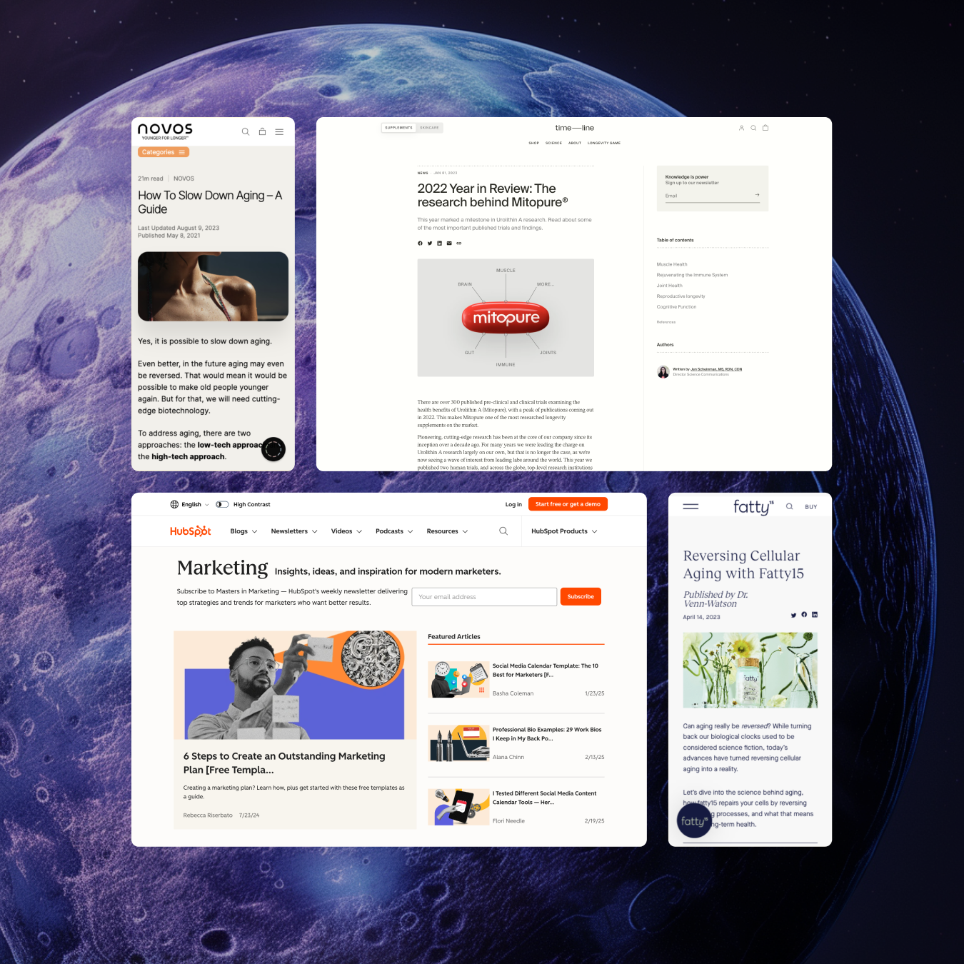
Timeline uses noticeably larger typography, likely recognizing that their demographic includes older readers who prefer comfortable, accessible reading experiences.
Generous spacing also creates a sense of rhythm, helping readers stay engaged without feeling overwhelmed.
Visual Breakup of Text
Breaking up dense paragraphs maintains pacing and prevents fatigue.
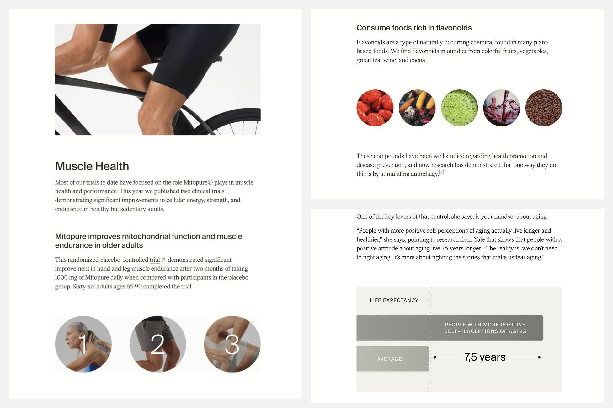
Timeline inserts product images, illustrations, or CTA banners mid-article to provide visual relief. This creates a visual cadence that extends scroll depth and supports a more natural storytelling flow.
2. Above-the-Fold Experience (Desktop & Mobile)
What appears at the top of the blog post strongly affects bounce rate and scroll depth. Across benchmarks, high-performing blogs optimize the above-the-fold area differently for mobile and desktop, but with the same goal: give the reader enough context to want to keep scrolling.
Mobile Above-the-Fold Optimization
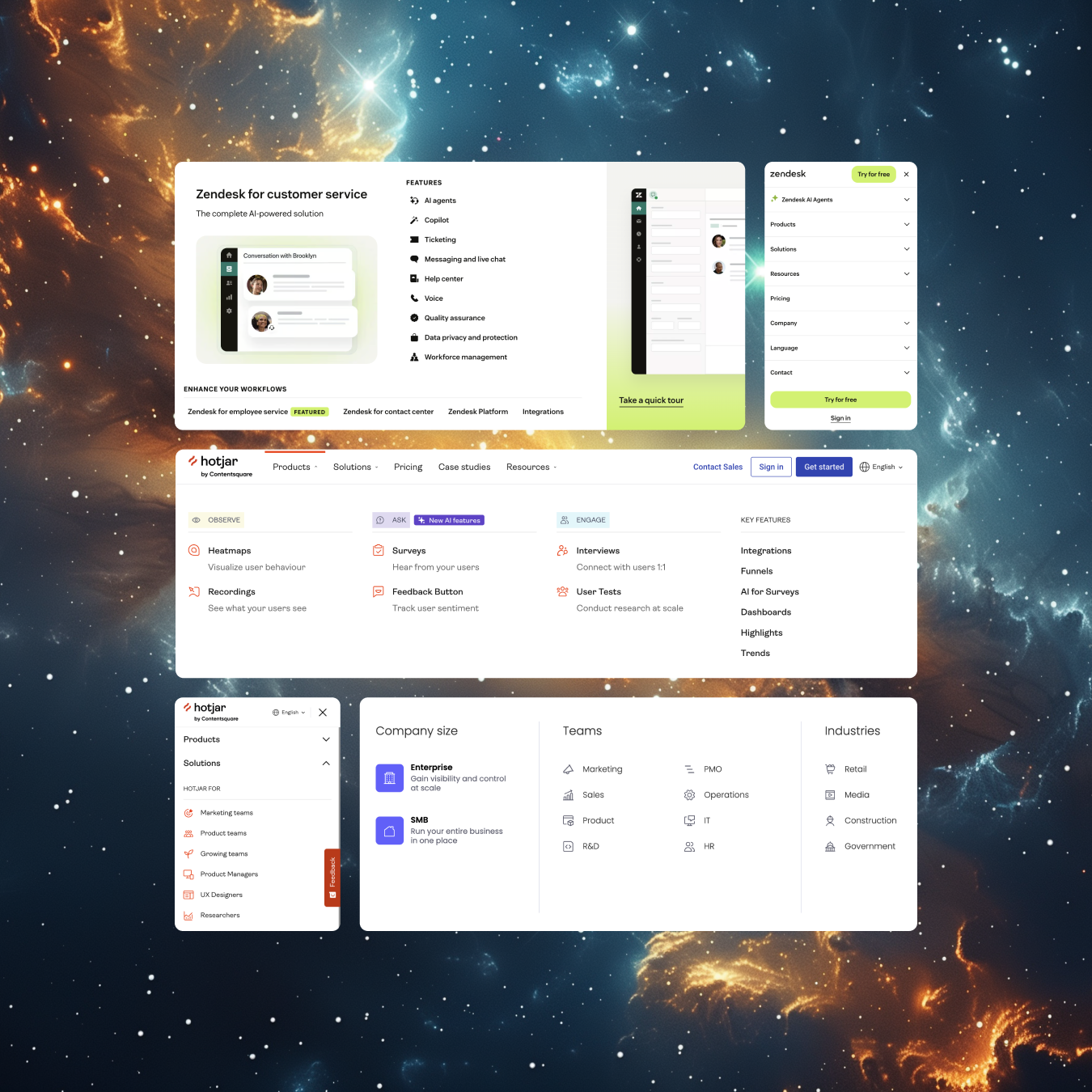
A standout pattern is the emphasis on allowing users to see actual article content immediately. We saw some brands try to avoid “giant hero images” that block the page.
Examples:
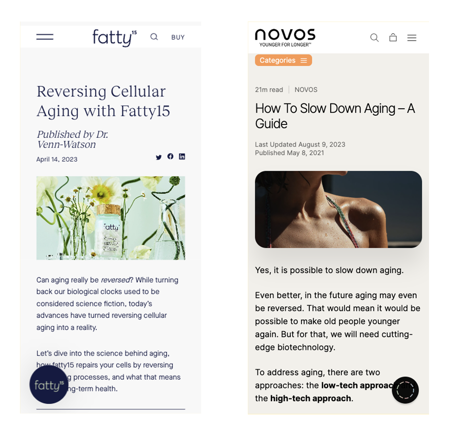
Fatty15 keeps the mobile header compact. The title, meta info, header image, and the first few paragraphs of the article appear above the fold. This helps the reader get straight into the article without scrolling.
Novos uses a similar structure: read time, headline, updated/published dates, header image, and the opening paragraphs are visible without scrolling.
This supports faster comprehension and reduces bounce rates by showing value immediately.
Desktop Above-the-Fold Richness
Desktop layouts allow for more information upfront without overwhelming the user, if executed cleanly.
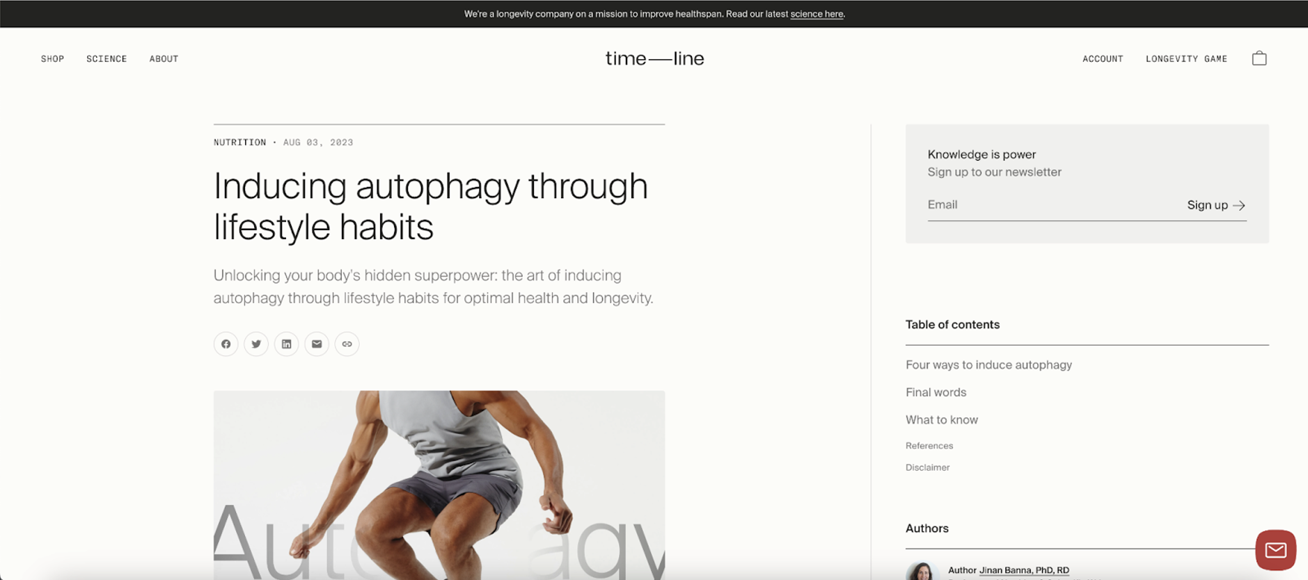
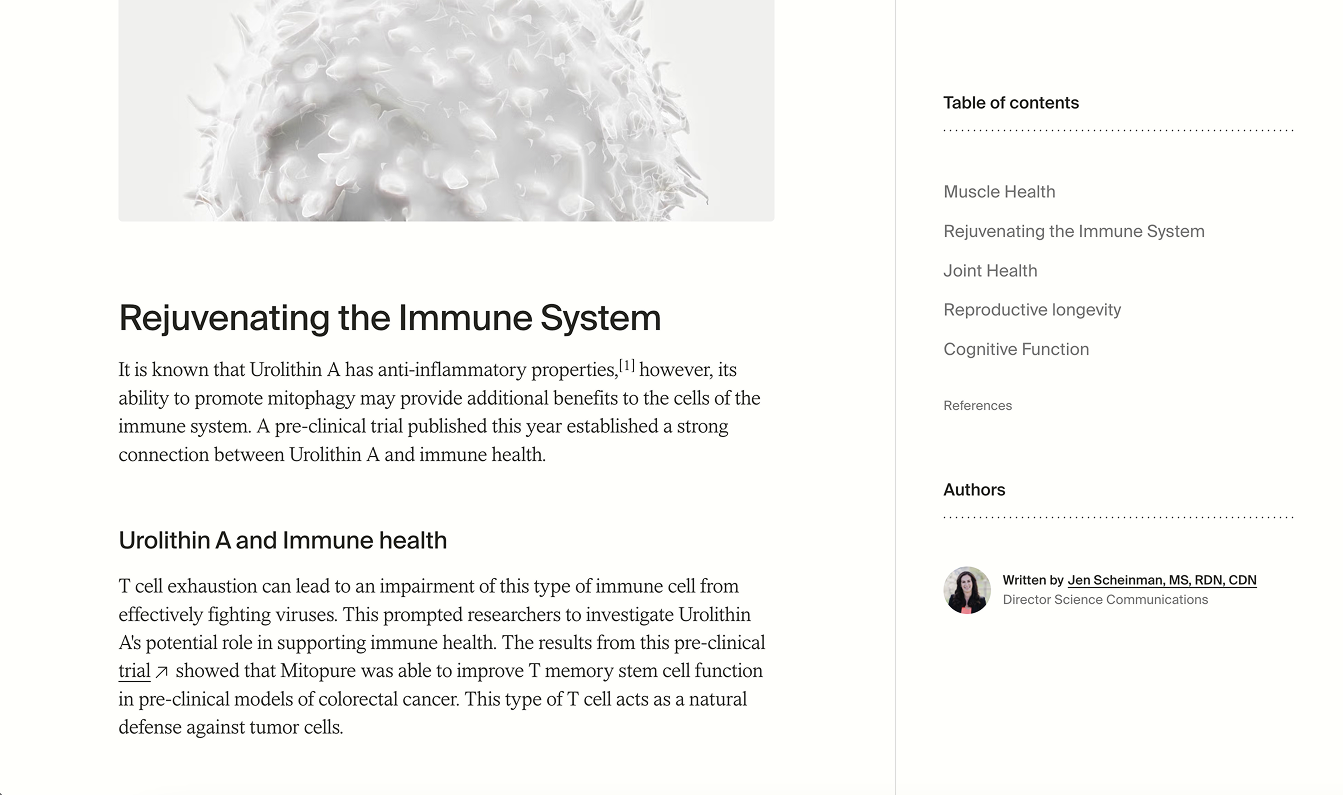
Timeline’s layout is a standout example, packing several elements neatly above the fold:
- Category
- Published date
- Headline & subheadline
- Header image
- Newsletter subscription
- Table of contents
- Authors with credentials (e.g., PhD, RD)
The result is a rich yet scannable first impression that solves orientation, builds trust, and encourages engagement before the reader scrolls at all.
3. Author Credibility & Expertise Signals
Across all benchmarked brands, credibility elements were some of the strongest recurring patterns. These cues matter because blog posts, especially in some industries like wellness, often fall into sensitive or high-stakes topics.
Clear Author Attribution
Users trust content when they know who wrote it.

Fatty15 highlights that articles are written by a doctor and co-founder, which elevates trust immediately.
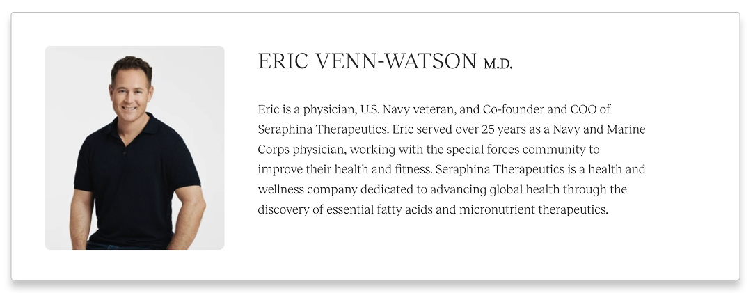
At the bottom of the article, they also include a short author bio, reinforcing credibility and giving the content a human, professional voice.
Clear attribution helps readers feel confident that the information is backed by real expertise, not generic content.
Scientifically Reviewed By
Scientific review attribution and expertise labels were especially strong credibility builders commonly used by health and wellness-focused brands.

Life Extension writes “Scientifically reviewed by: Michael A. Smith, MD,” which signals that the content has been vetted by a qualified professional.
They also label their author as a “Health & Wellness Writer,” providing additional context about the writer’s subject-matter focus and helping readers understand the perspective behind the content.
These elements are particularly powerful in YMYL (Your Money or Your Life) categories, where both users and search engines place high value on accuracy, expertise, and transparency.
Visible Credentials

Timeline prominently displays author credentials such as PhD, RD, and MD within the author information section of the sticky panel. Keeping these credentials visible as readers scroll reinforces expertise throughout the entire reading experience. It’s a subtle but powerful way to signal that the content is grounded in professional knowledge, helping readers trust the information and view the article as more authoritative than generic content.
4. Navigation Enhancements: TOC, Sticky Panels, and Smart Mobile Adaptation
Navigation tools help users move through long-form content without getting lost, increasing both engagement and completion rates.
Table of Contents (TOC)
A TOC has become a best practice for high-performing blogs.
Examples:
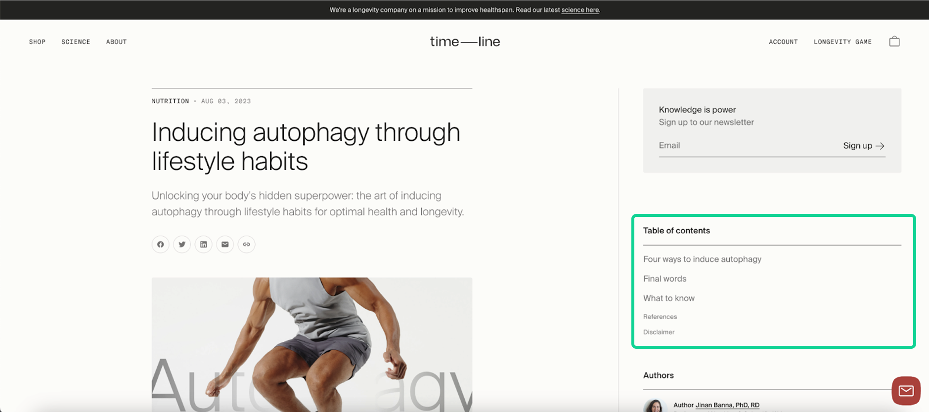
Timeline places a robust TOC above the fold, making it easy for non-linear readers to jump to relevant sections.
Benefits:
- Supports long-form reading by breaking content into digestible chunks
- Improves SEO through anchor links
- Increases the likelihood of earning featured snippets
- Helps readers see the value of the article at a glance
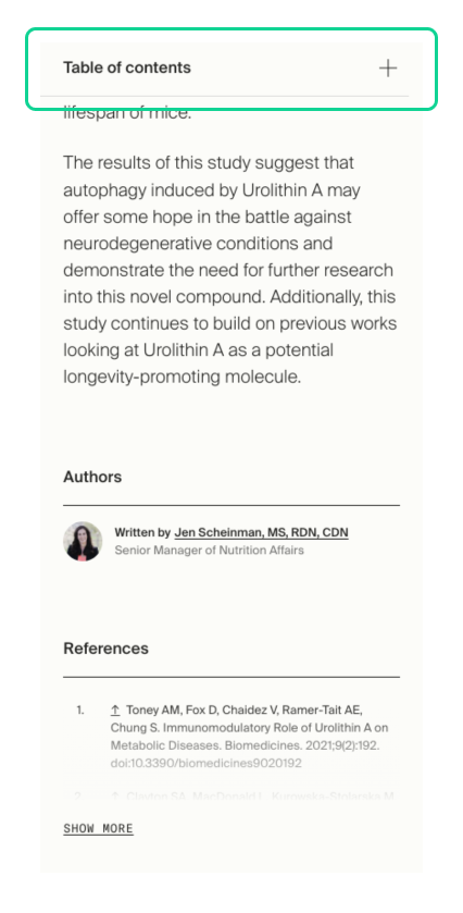
Timeline’s mobile adaptation is especially clever, turning the TOC into a sticky accordion at the top of the screen. This maintains functionality without cluttering the layout.
Sticky Right Panel (Desktop)

Timeline’s sticky sidebar is another standout best practice. As users scroll, they always have access to:
- TOC
- Author info
- Author credentials
This persistent access reduces friction, encourages deeper scrolling, and reinforces trust throughout the reading experience.
Breadcrumbs
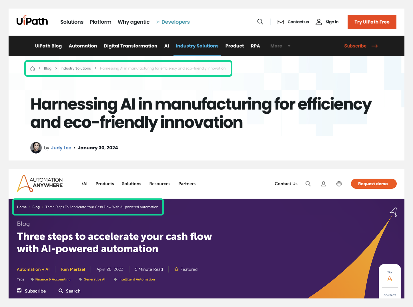
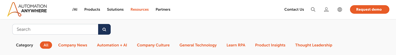
Breadcrumbs were used on blogs from UiPath and Automation Anywhere, and they deliver outsized value despite their subtlety.
Why Breadcrumbs Matter for Blogs:
- Improved Orientation: They show readers exactly where they are within the blog structure, helpful for blogs with multiple categories or resource hubs.
- Better Exploration: Users can easily move to category pages or related topics without relying on the back button.
- Stronger Internal Linking: Breadcrumbs automatically connect blog posts to category pages, supporting topic clusters and distributing link equity.
- Enhanced SEO: When implemented with structured data, breadcrumbs can appear in search results, improving clarity, click-through rates, and indexing.
Small UI element, big UX and SEO payoff.
5. CTA Placement & Conversion Patterns
CTAs in high-performing blogs are subtle, context-aware, and intentionally spaced to feel supportive, not salesy. The strongest blogs weave conversion opportunities naturally into the reading experience, offering value at the right moments without overwhelming the user.
Bottom-of-Post CTA Banners

Fatty15 uses a clean, minimalist CTA banner at the bottom of the article.
- Perfect for top-of-funnel and mid-funnel content
- Does not interrupt the reading experience
- Reaches users at a natural decision point: after they’ve consumed value
Mid-Content CTAs
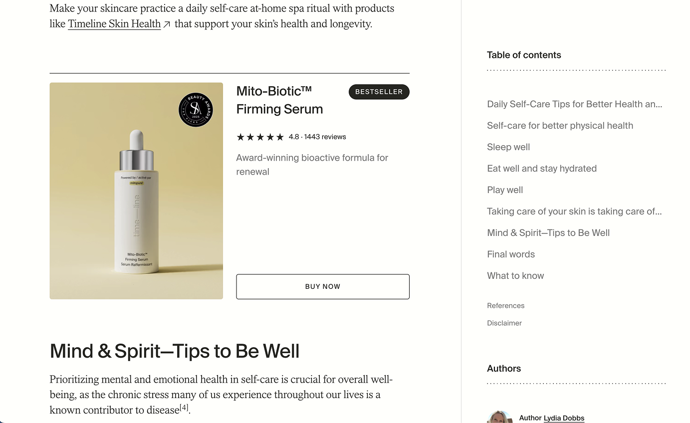
Mid-content CTAs were less common across competitors, but Timeline provides a strong example of how to execute them effectively. They insert a simple product card within the article, featuring a:
- Product image
- Short value statement
- Low-contrast or muted background
- “Bestseller” label
- Award badge
- 5-Star rating & number of reviews
- Large “Buy Now” CTA button
Because the styling blends seamlessly with the surrounding content, the module feels like a natural extension of the article rather than an intrusive ad. This subtle design allows the CTA to enhance the reading experience while still creating a clear conversion touchpoint.
Sidebar CTAs
Sidebar CTAs are a common pattern across SaaS and enterprise blogs, especially on desktop where wider screens naturally create additional horizontal space. Because the main content column is constrained by optimal line length, the margins often become an opportunity to place CTAs without interrupting the reading flow.
Across the benchmarked examples, we observed several effective approaches:
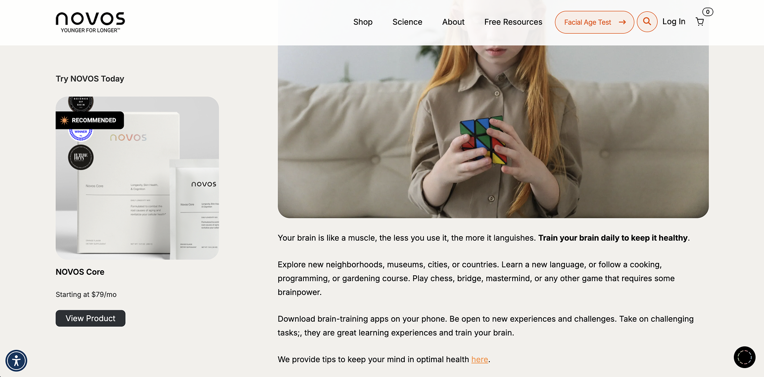
Novos previously used a product-focused sticky CTA in the sidebar that included a product photo, name, price, and a clear CTA button. Although it’s no longer sticky, the earlier implementation demonstrated how a product card can sit subtly alongside long-form content without feeling intrusive.

Automation Anywhere makes strong use of the sidebar by stacking multiple CTAs beneath the “Related Blogs” module, such as a promotional banner for an event and a separate CTA to download a whitepaper. This approach lets users explore deeper resources as they browse.

HubSpot uses a small, focused CTA box to promote a whitepaper closely tied to the blog content, creating a clean and helpful mid-funnel touchpoint.
When executed thoughtfully, sidebar CTAs work well for readers who skim or scroll quickly, providing convenient next steps without breaking the flow of the article. The key is balance. Overloading the sidebar can feel distracting, so it’s important to keep the design clean, aligned, and contextually relevant to the content.
6. Content Elements That Increase Engagement
These elements appeared frequently and consistently across top performers, creating predictable moments of engagement and trust.
Read-Time Indicators
Novos uses read-time metadata (e.g., “21 min read”) prominently above the fold.
- Sets expectations
- Increases completion rates
- Signals content depth and value

Published + Updated Dates
Some brands show both the original publish date and the most recent update.
- Strong trust cue for readers
- Strong freshness signal for search engines
- Helps long-form educational content maintain relevance
Rich Visuals & Breakout Elements
Across all benchmarked brands, strong visuals were used generously, including:
- Images
- Illustrations
- Charts and graphs
- Product photos
- Highlighted text boxes
- Pull quotes
These increase readability, break monotony, and support different learning styles.
What the Blog Collection Page Should Include
Your blog template isn’t complete without a strong blog collection (listing) page - the hub that organizes your content ecosystem. A well-structured listing page improves navigation, supports topic clusters, and drives more visitors into the right content paths. Across competitor benchmarks, the best-performing brands treated their blog collection page like a strategic experience, not just a simple list of posts.
Below are the elements consistently used across leading brands and why they matter.
1. Featured Posts

Highlighting a set of featured articles at the top of the listing page was one of the most reliable patterns we saw across various blogs.
Featured posts serve several purposes:
- Showcase authority-defining or high-converting content
- Guide new readers toward your most impactful articles
- Increase visibility for pillar or cornerstone content
- Improve engagement by surfacing high-value resources users may otherwise miss
This section acts as the “editor’s pick” for your blog and helps shape a curated content experience.
2. Blog Categories (Clear, Clickable, and SEO-Driven)
Categories are essential for both UX and SEO, acting as the backbone of your content structure. High-performing blogs make categories immediately visible and easy to browse.
Benefits:
- Helps users quickly find topics relevant to their interests
- Reduces cognitive load by breaking content into digestible themes
- Reinforces SEO-focused topic clusters
- Improves internal linking across related posts
- Signals to search engines how your content is organized
Clear category design supports both discovery and hierarchy, especially for blogs with deep libraries.
3. Email Subscribe Box
Nearly every benchmarked brand placed an email subscribe module on the listing page, often near the top.
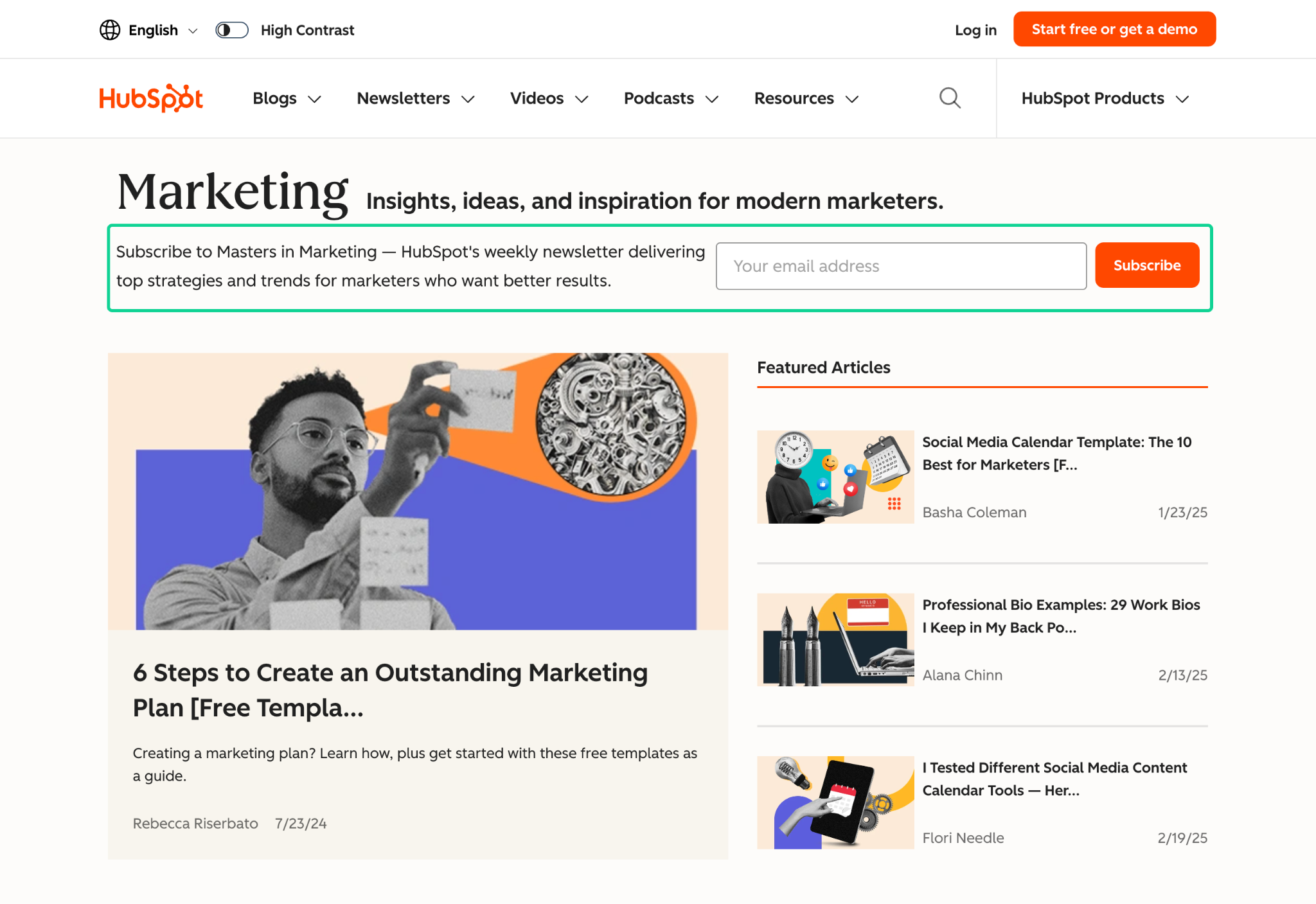
HubSpot does this exceptionally well by using a simple value prop and a low-friction email field. Placing it early captures users who may be browsing without committing to a specific piece of content yet.
A well-timed subscribe CTA helps convert passive readers into long-term audience members early in their journey.
4. Search Bar
A search bar becomes especially valuable once your blog reaches 40+ posts, when browsing by category alone is no longer efficient.
Why it matters:
- Enables users to find specific answers quickly
- Reduces the likelihood of bounce if users don't immediately see what they want
- Helps power users search topics, formats, or terms relevant to their goals
- Supports content depth by surfacing older but still valuable posts
Search bars are a simple but powerful feature for engagement and retention.
5. Filters for More Precise Discovery
Filters were used in some blogs to help users refine content based on their intent or profile.
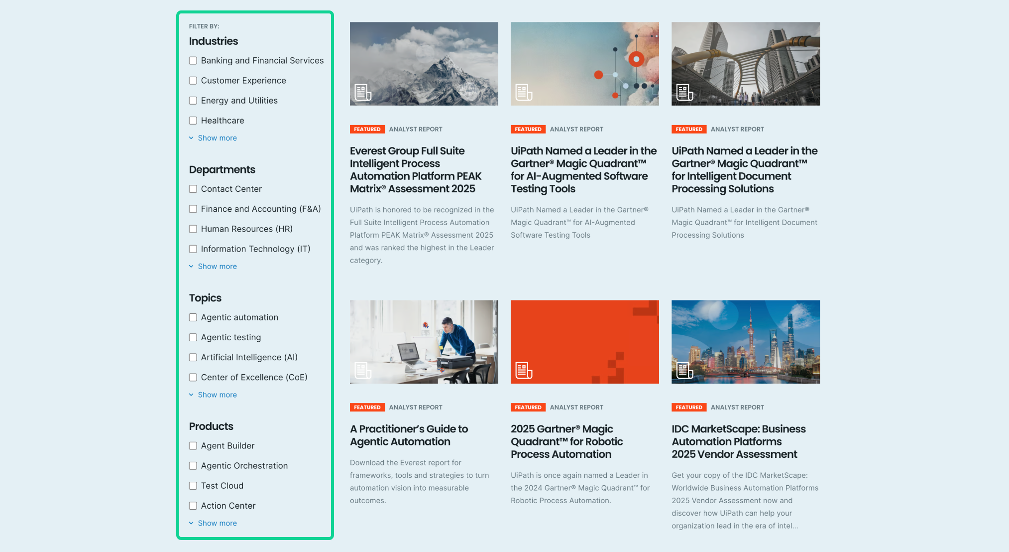
Common filters include:
- Topic (e.g., automation, health, UX)
- Industry (e.g., healthcare, finance, tech)
- Persona (e.g., IT leaders, marketers, developers)
- Content type (e.g., articles, guides, templates, case studies, webinars)
Why this matters:
- Helps readers find content tailored to their roles or use cases
- Supports first-party data collection when integrated with analytics
- Improves time on site and reduces friction for users with specific goals
- Works especially well for enterprise, B2B, and multi-audience brands
Filters turn a passive collection page into an interactive browsing experience.
6. Other Resources Modules (Mid-Funnel Conversion Boosters)
Industry-leading blogs extend beyond articles and incorporate additional resources, creating a mini resource center directly within the blog listing page.
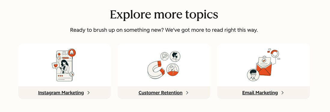
For example, HubSpot includes these resources on their blog listing page:

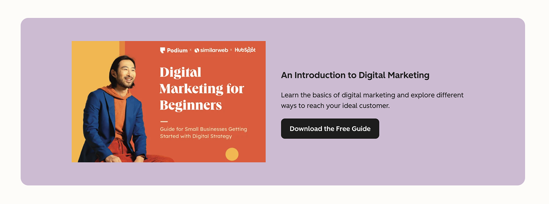
These serve as mid-funnel conversion points, offering deeper value for readers who want more than a blog post. This approach also:
- Increases the consumption of high-value assets
- Moves users naturally from TOFU → MOFU → BOFU
- Enhances engagement by offering multiple content formats
- Demonstrates depth, expertise, and brand authority
A strong resources module helps convert educational intent into actual leads or subscribers.
Final Thoughts: Your Blog Template Is a Conversion Opportunity
Your blog isn’t just a place to publish articles. It’s a conversion engine, a brand builder and a trust amplifier. A well-optimized template helps you deliver a better reading experience, improve SEO performance and create more opportunities to convert readers into buyers or leads.
If your blog template hasn’t been updated recently or if your metrics show low engagement, it may be time to revisit your design strategy.
Ready to Optimize Your Blog Template?
A high-performing blog template can increase engagement, reduce bounce rate and improve conversions.
If you'd like help benchmarking your own blog and identifying improvement opportunities, book a free consultation with our team at KARL Mission.
Book a Free Website Consultation
Discover quick wins for your digital strategy. 100% guaranteed.