Ecommerce sales emails are some of the highest revenue-generating assets in your entire marketing stack.
They are also some of the most overused.
Every brand runs promotions. Every brand claims urgency. Every brand says “limited time only.” The difference between an email that drives serious revenue and one that gets ignored comes down to structure, clarity, and conversion intent.
In a past competitor benchmark we did, we analyzed how major ecommerce brands structure their deals and sales emails. What stood out was not just design trends, but deliberate choices about layout, urgency, product density, and personalization.
Let’s break down what actually works and how to apply it strategically.
Start With Navigation
One of the most consistent trends we saw was category links at the very top of the email.
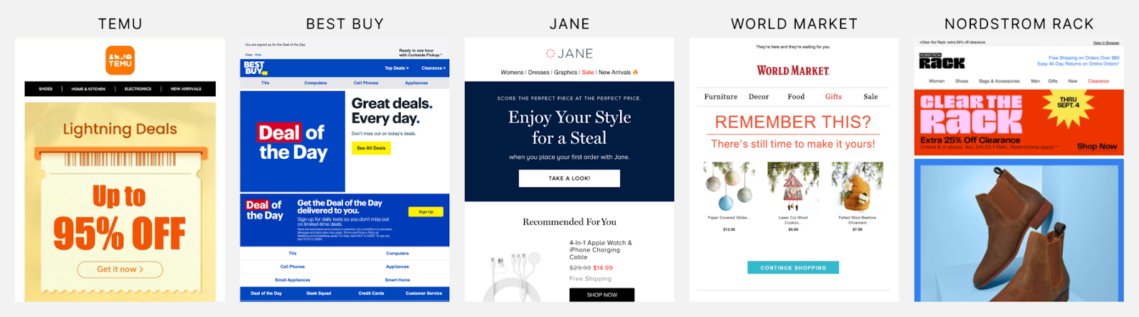
These function like a mini website navigation bar. Instead of forcing users to scroll through a single curated message, brands surface their most valuable product categories immediately.
This does two things:
First, it shortens the path to high-intent browsing. If someone opened your email specifically looking for shoes, skincare, or tech accessories, they can get there in one click.
Second, it increases the overall click-through rate because you are offering multiple entry points.
We also saw category links repeated within the body of the email, often paired with icons or imagery. This reinforces structure and makes dense sales emails feel organized rather than chaotic.
If your sales emails feel overwhelming, adding clear category navigation can dramatically improve usability.
Urgency: The Countdown Timer Effect
A large countdown timer at the top of the email was another common pattern.
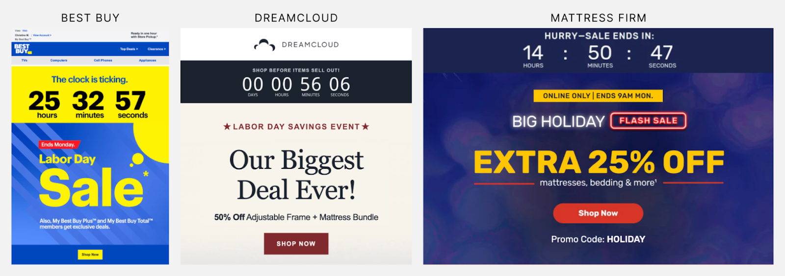
Brands lean heavily into urgency for deal campaigns. Flash sales, daily deals, limited-time offers. A visible timer visually reinforces that the opportunity is expiring.
Psychologically, this shifts the email from informational to time-sensitive. It increases perceived risk of inaction.
But here is the important part: urgency only works if it is credible.
If you send a 24-hour flash sale every single day, your audience learns that nothing is truly limited. Overuse erodes trust.
Use countdown timers strategically. Tie them to real deadlines. Pair them with clear messaging such as “Ends tonight” or “72-hour exclusive.”
When done properly, urgency is one of the most powerful levers in ecommerce email marketing.
The Animated, Mobile-First Header
We saw a consistent pattern of bold, eye-catching header images, especially from brands like Temu.
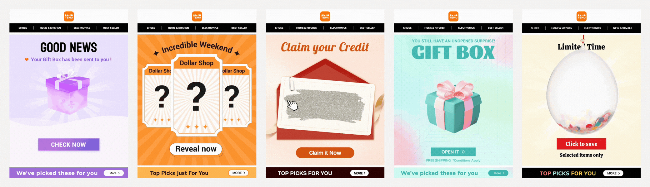
Their headers are often animated, vertically designed, and optimized for mobile screens. Big text. High contrast visuals. Clear discount messaging.
This makes sense when you consider that a majority of ecommerce emails are opened on mobile devices.
Vertical, scroll-friendly designs with strong visual hierarchy are not just aesthetic decisions. They are performance decisions.
If your header looks beautiful on desktop but cluttered on mobile, you are leaking clicks before users even scroll.
Design your sale emails mobile-first. Desktop is secondary.
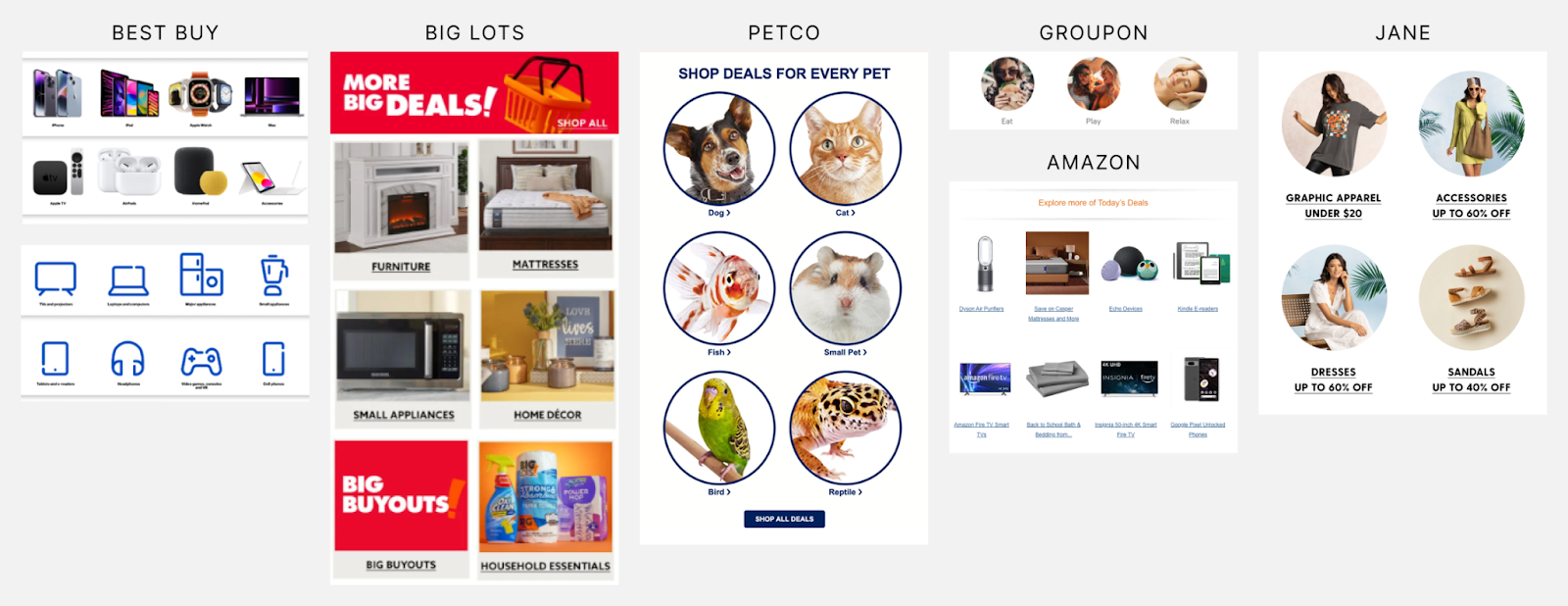
Personalization or the Illusion of It
Another recurring pattern was banners with messaging like “Top Picks for You.”
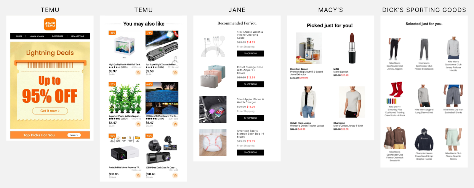
Whether these sections are truly personalized or simply highlight top-selling products, the framing creates a sense of relevance.
Personalization does not always require advanced dynamic logic. Sometimes it is about perceived curation.
That said, true personalization can significantly increase performance:
- Behavior-based recommendations
- Recently viewed products
- Category-specific offers
- Cart abandonment reminders
If you have the data, use it. If not, use curated language intentionally.
In ecommerce marketing emails, relevance is everything.
Organizing the Chaos: Deal Categories
Sales emails can quickly become overwhelming. Many brands counter this by grouping deals into labeled sections.
For example, categories like:
- Best Sellers in 72 Hours
- Save at Least $5
- 50% Off or More
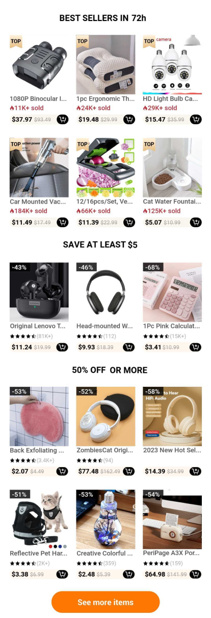
This helps users scan. It turns a long email into structured segments.
Cognitive load decreases when users can mentally bucket products. Instead of browsing randomly, they browse with intent.
From a CRO perspective, segmentation inside the email increases engagement depth.
Deal Cards: 1 Column vs 2 Column vs 3 Column
The structure of product cards dramatically changes how your brand is perceived and how your email performs.
3-Column Layout
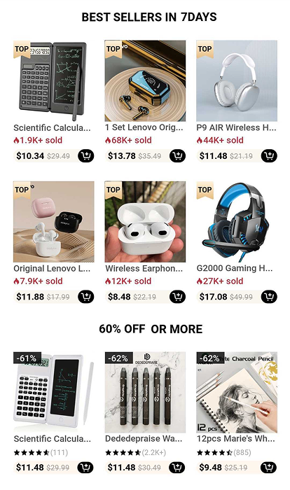
Temu often uses a 3-column grid.
The product image dominates the card. Product names are truncated. They show number sold, price, sometimes star rating, and include a small add-to-cart button.
This format feels dense and busy. It allows a large number of deals above the fold. It matches their brand positioning as a discount marketplace.
Pros:
- Maximum product exposure
- High visual stimulation
- Encourages impulse browsing
Cons:
- Can feel cluttered
- Harder to read product details
- Less space for persuasion
This format works best when price and visual appeal are the main drivers.
2-Column Layout
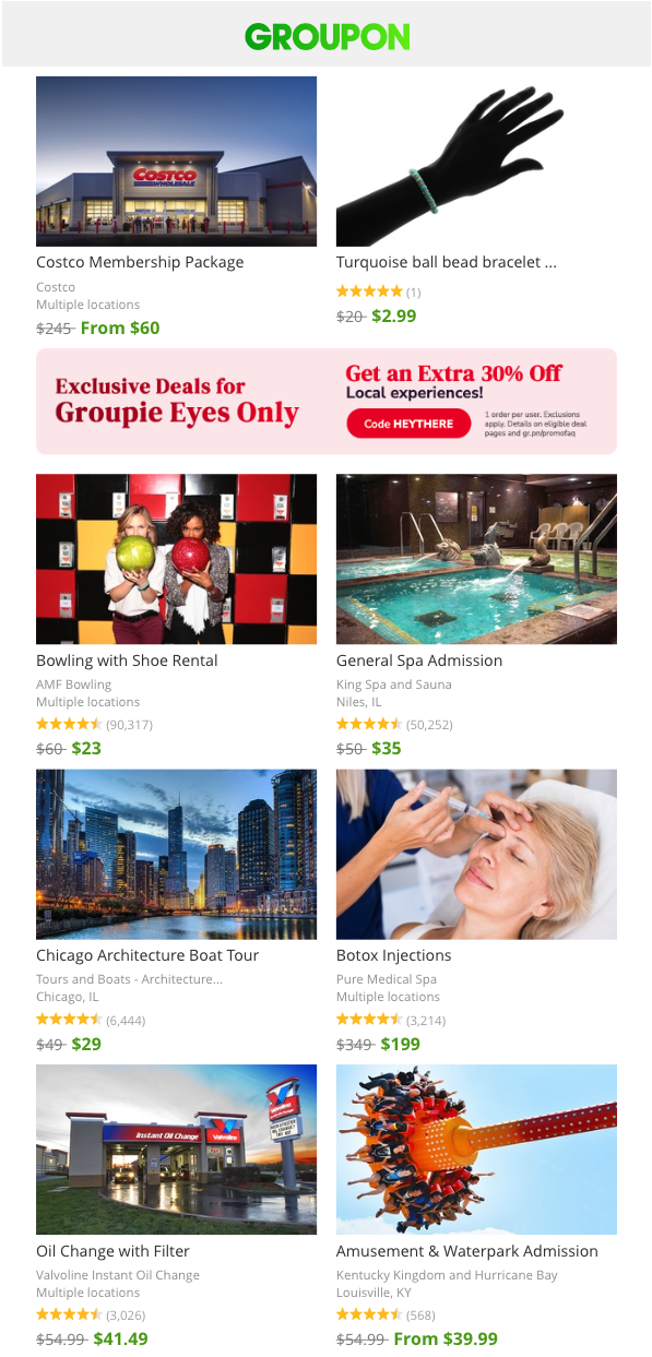
Groupon often uses 2 columns.
Images are larger. Deal titles are clearer. Location, ratings, original price crossed out, and deal price are shown.
Pros:
- Better readability
- Stronger visual emphasis
- Balanced density
Cons:
- Fewer products per screen
- Slightly longer scroll
This format works well when deals require more context or explanation.
1-Column Layout
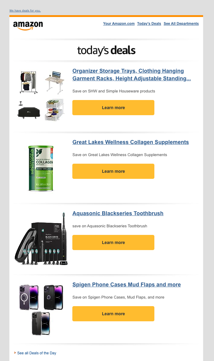
Amazon frequently uses a single-column layout for their daily deals emails.
However, they don’t really maximize the available space. The product image is too small, but at least there is a prominent yellow CTA button. They don’t list other valuable information like the price, rating, or any product details.
Best Buy also uses a 1-column layout for their Deal of the Day emails but leverages the space more effectively. Larger image. Full product name. Original price. Savings amount. Star rating. Large CTA.
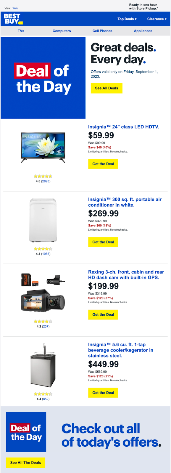
The likely reason that the 1-column format often appears in these daily deal emails is because they are sending them out everyday, so each email highlights fewer products.
Pros:
- Clean and focused
- More space for persuasion
- Ideal for higher-ticket items
Cons:
- Limited product count
- Longer email if showcasing multiple items
Your choice should align with brand positioning and product complexity.
Cheap, impulse-driven catalogs may benefit from density. Premium or technical products may need breathing room.
Trust Signals at the Bottom
Many sales emails end with trust-building USPs.
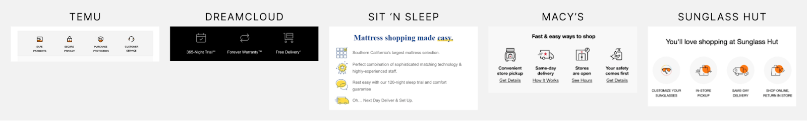
For example, Temu includes icons for safe payments, secure privacy, purchase protection, and customer service.
When users are in a discount mindset, skepticism increases. Is this too good to be true? Is this site legitimate?
Reassurance reduces friction.
If your brand struggles with conversion due to lack of trust, test adding visible trust indicators to your emails.
Beyond Design: Strategic Layers of Ecommerce Sales Emails
Design patterns matter. But structure alone does not guarantee revenue.
High-performing ecommerce marketing emails typically include:
- Clear segmentation. Your VIP customers should not receive the same messaging as first-time buyers.
- Offer strategy. Not every sale needs to be a percentage discount. Bundles, thresholds, and tiered savings often outperform blanket promotions.
- Testing culture. Subject lines, send time, discount framing, image style, CTA copy. All testable.
Many brands ask, “How often should I send promotional emails?” The answer depends on list engagement and brand tolerance. Some audiences expect daily deals. Others will churn if over-contacted.
The real question is whether each email adds value or simply adds noise.
Bringing It Back to Conversion Rate Optimization
At the end of the day, ecommerce sales emails are not design exercises. They are revenue engines.
The brands we benchmarked are not guessing. They are testing relentlessly.
If your promotional emails are underperforming, the issue is rarely just the discount. It is often layout, hierarchy, segmentation, or friction.
At KARL Mission, we approach ecommerce email marketing through a conversion lens. That means:
- Aligning design with buyer psychology
- Testing structure and density
- Optimizing CTAs and messaging
- Integrating email data with onsite behavior
If you want your deal emails to drive more than just opens, it starts with strategy.
Book a free consultation and we will review your current ecommerce email performance and identify clear opportunities to increase revenue.
Book a Free Website Consultation
Discover quick wins for your digital strategy. 100% guaranteed.