Most websites publish content. Very few organize it in a way that actually works.
Over time, blog posts, guides, case studies, videos, and tools pile up. They live in silos. They are hard to find. They are rarely connected strategically. And they almost never function as a conversion asset.
A well-built resources library page changes that.
Done right, a resource center becomes a search engine magnet, a lead nurturing engine, and a quiet but powerful driver of inbound leads. Done poorly, it becomes a cluttered archive that no one uses.
In this guide, we will walk through how to create a resources library page that supports SEO, improves user experience, and drives real business results.
What Is a Resources Library Page?
A resources library page, sometimes called a resource center or knowledge hub, is a structured, searchable collection of your company’s educational content.
This can include:
- Blog articles
- Downloadable guides
- Templates
- Case studies
- Webinars
- Videos
- Podcasts
- Tools
- Customer stories
Instead of forcing users to navigate through a chronological blog feed, a resource library organizes content by topic, format, industry, or funnel stage.
It is not just a content archive but rather a strategic navigation layer designed to increase engagement and conversions.
Why Create a Resource Library on Your Website?
From a conversion and SEO perspective, there are three major benefits.
1. It Improves SEO Through Structure
Search engines reward clear information architecture.
When content is organized into logical topic clusters, with internal linking between related resources, you strengthen topical authority. This supports your broader SEO strategy and helps important pages rank higher. A resource library also allows you to target long-tail searches.
When structured properly, the library becomes an indexable asset instead of a passive archive.
If you are already investing in SEO but not seeing strong engagement metrics, your content structure may be part of the issue. This connects directly with your search engine optimization strategy.
2. It Increases Time on Site and Engagement
When users can filter by topic, format, or industry, they explore more.
Instead of reading one blog post and leaving, they discover related content. That reduces bounce rate and increases session depth. Both are positive signals for SEO and strong indicators of buying intent.
From a UX perspective, this is about clarity and control. Visitors feel guided instead of lost. That is where UX research and design plays a critical role.
3. It Moves Visitors Closer to Conversion
A resource library supports different awareness stages:
- Early stage visitors looking for educational content
- Mid stage visitors comparing approaches
- Late stage visitors reviewing case studies or implementation details
When structured intentionally, you can guide users from education to solution. Strategic CTAs inside your library can promote your core services.
This is where many companies miss the opportunity. They treat the library as purely informational.
Step 1: Define the Strategic Purpose of Your Resource Library
Before designing anything, ask:
- Is this meant to generate leads?
- Support SEO?
- Nurture existing prospects?
- Position us as industry experts?
The answer is usually all of the above. But prioritization matters.
For example, if your primary goal is inbound leads, you may gate high-value assets like templates or reports. If your goal is authority and organic growth, you may leave everything open and focus on internal linking.
Without a defined purpose, the page becomes decorative.
Step 2: Choose a Logical Structure
This is where most resource libraries fail.
Avoid a simple “all resources” grid sorted by date. That is just a blog page with a different title.
Instead, structure by:
- Topic categories
- Service or product lines
- Industry
- Funnel stage
- Content type
- Audience
Each category can function as a mini content hub with internal linking between pillar articles and supporting content. This strengthens your topical clusters and supports ranking improvements.
This structure should align with your service or product pages. It reinforces your commercial positioning without feeling promotional.
Step 3: Make It Searchable and Filterable
A true resource library should include:
- Keyword search functionality
- Filter options
- Clear tagging system
If a user wants only case studies or only beginner guides, they should find them instantly.
From a user experience perspective, friction kills exploration. From a CRO perspective, friction kills conversion.
If your library contains more than 20 to 30 pieces of content, filters are not optional.
Step 4: Optimize for SEO the Right Way
A resource library page should be treated as a high-value SEO asset.
This means:
- Optimized H1 and H2 structure
- Clear category URLs
- Internal links to and from service pages
- Schema markup for articles where appropriate
- Descriptive meta titles and meta descriptions
You can also create pillar pages within the library that target high-intent keywords. Each pillar page should link to supporting blog posts, case studies, and guides.
This aligns directly with a modern search engine optimization and content cluster strategy.
Step 5: Design for Conversion, Not Just Content
This is where strategy matters most.
A resources library should include:
- Contextual CTAs within content cards
- A strong mid-page CTA section
- A final CTA promoting a free consultation
Avoid aggressive popups. Instead, position calls to action naturally.
For example:
- After three related resources, suggest a strategy session
- After a case study, invite readers to discuss similar results
- After educational content, offer a performance audit
This is how you connect content consumption with pipeline growth.
If your library generates traffic but no leads, the issue is usually CTA placement or messaging. That is a conversion rate optimization problem, not a content problem.
Step 6: Maintain and Evolve the Library
A resource library is not a one-time project.
Review quarterly:
- Outdated content
- Underperforming pages
- Broken links
- New keyword opportunities
You should also analyze:
- Which categories drive the most engagement
- Which content assists conversions
- Where users drop off
This requires proper tracking setup inside your analytics stack. Without it, you are guessing.
Common Mistakes to Avoid
The most frequent issues we see:
- Treating the library as a blog archive
- No filtering or search
- Weak internal linking
- No conversion strategy
- Poor mobile experience
- Overdesign without usability testing
A resource library should feel simple and structured, not flashy. Clarity converts.
What High-Performing Brands Are Doing
Looking at how established brands structure their resource libraries reveals clear patterns. While the visual styles vary, the underlying architecture is surprisingly consistent.
Here is what stands out.
Category Filters at the Top
One of the strongest patterns is immediate categorization at the top of the page.
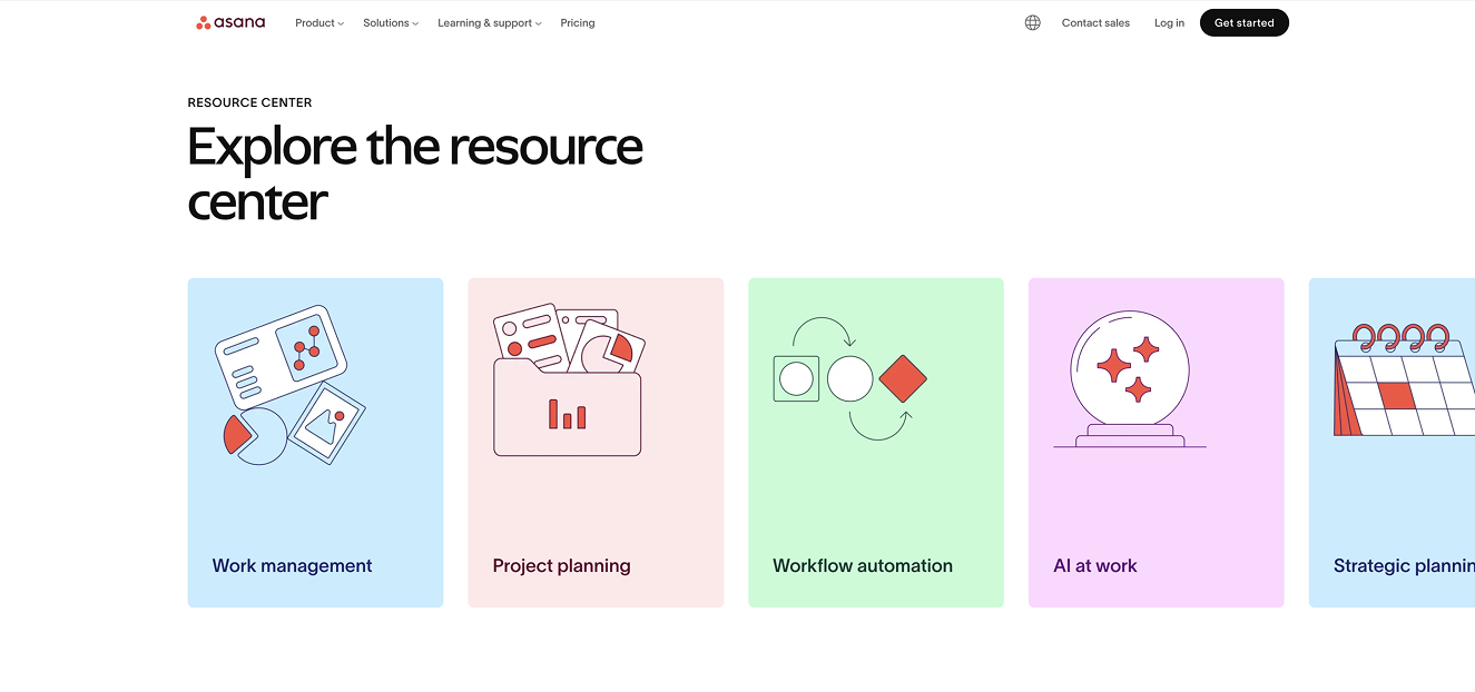
Asana does this particularly well. Their Resource Center page functions almost like a directory. At the top of the page, they introduce key categories aligned with their product functions, such as Work Management, Project Planning, and Workflow Automation. Each category is represented with a colorful icon that visually reinforces the theme.
This does two things strategically:
First, it reinforces product positioning without selling.
Second, it reduces cognitive load by helping users immediately self-select into relevant content.
On their “All Resources” page, these same categories appear again as filter buttons above the resource grid. The structure is consistent across the experience, which is important for usability.
This is a strong example of aligning content architecture with product strategy.
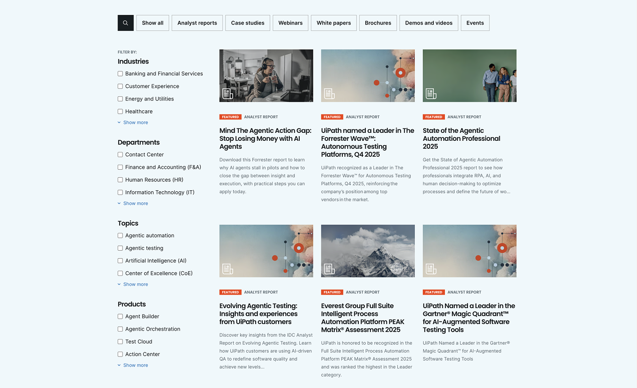
Here's another example from UiPath below:
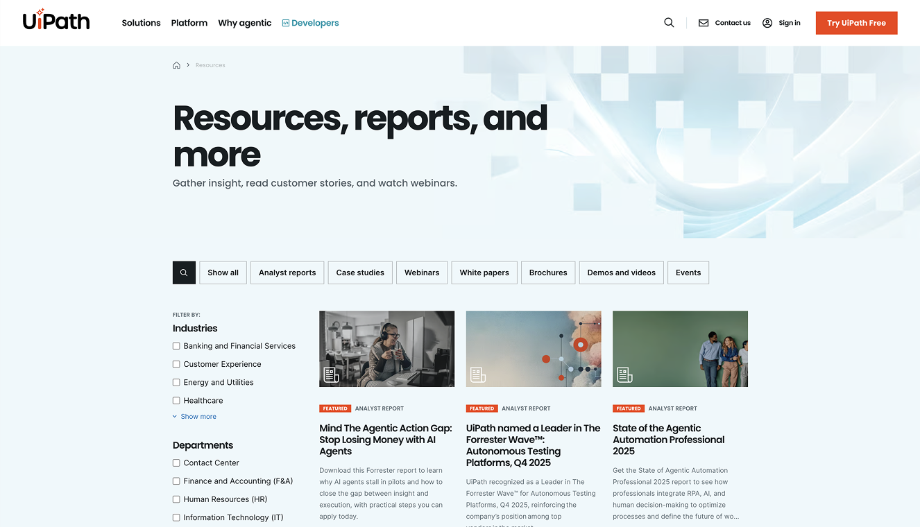
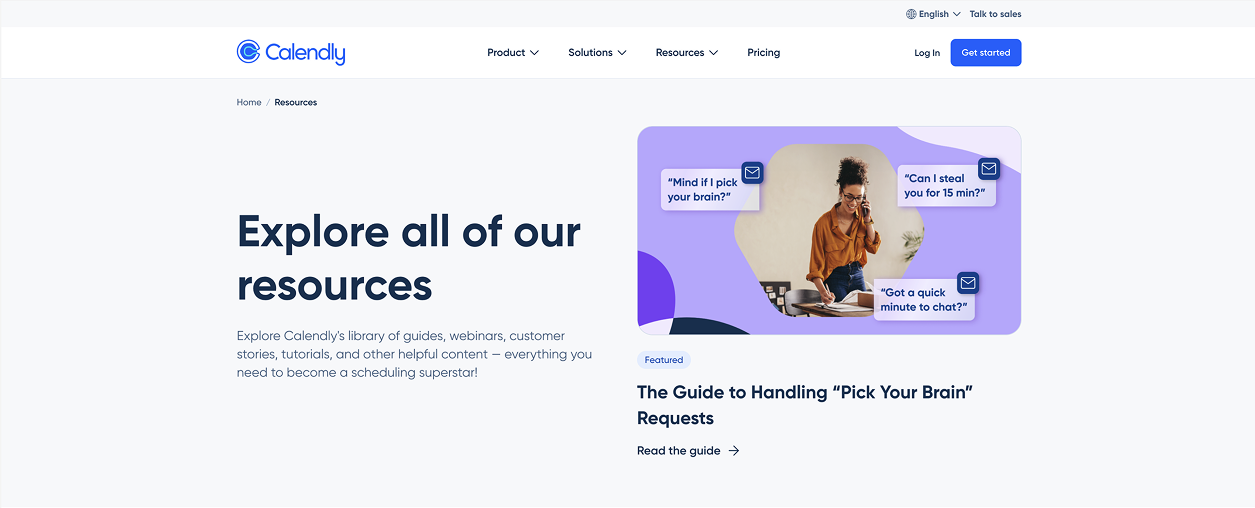
Categorizing by Resource Type
Other brands organize primarily by format.
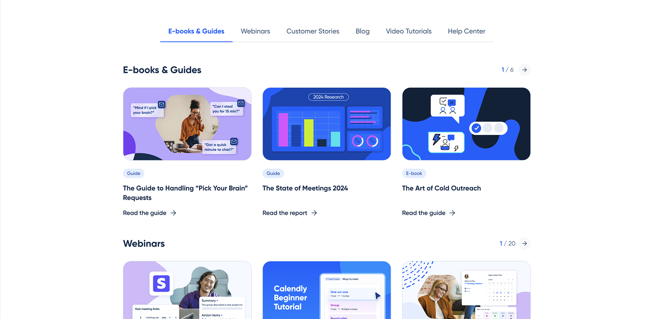
Calendly uses a quick-link navigation bar that directs users to different resource types such as ebooks, webinars, customer stories, blog content, video tutorials, and their help center.
This approach works particularly well when a company produces content in multiple formats and wants to make those formats easily discoverable.
However, from a UX perspective, this navigation would be even stronger if the quick links remained sticky as users scroll. When a page becomes long and filter-heavy, persistent navigation can significantly improve usability.
The takeaway here is that categorizing by resource type is effective, but usability details matter.
Audience Segmentation: Organizing by Department or Role
Some products and services benefit from grouping content by audience.
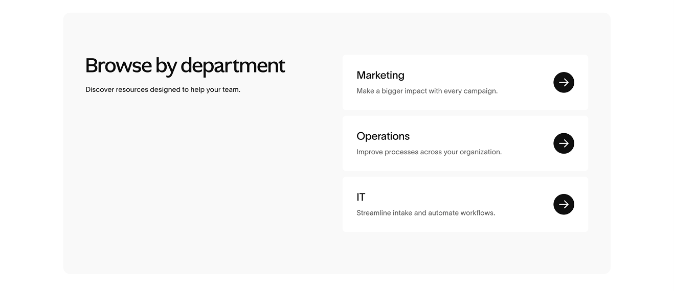
Again, Asana provides a strong example. On their Resource Center page, they include a “Browse by Department” section where content is sorted for Marketing, Operations, and IT teams. This team-based filter also appears on their All Resources page.
This is especially powerful for:
- B2B companies
- Platforms serving multiple departments
- Products with distinct use cases by role
Audience segmentation increases relevance immediately. A marketing manager does not want to sift through IT documentation. A finance lead does not want generic productivity content.
When your product touches multiple functions, audience filters are often more powerful than topic filters.
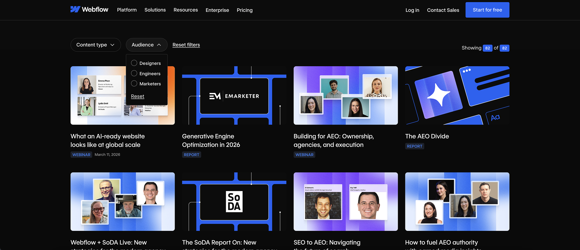
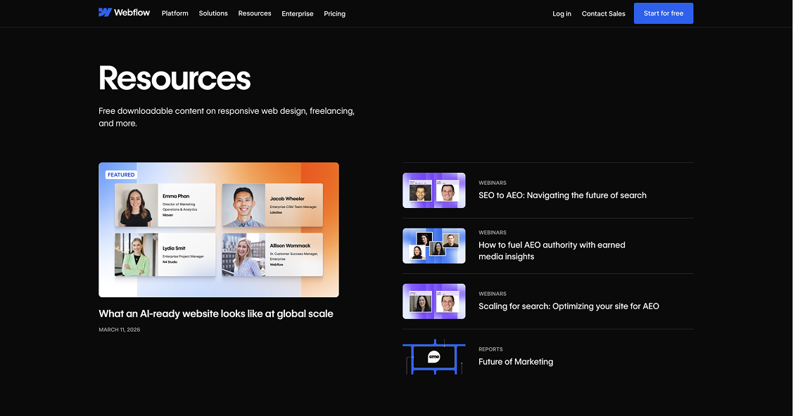
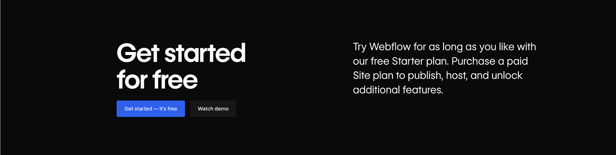
Here's another example from Webflow:
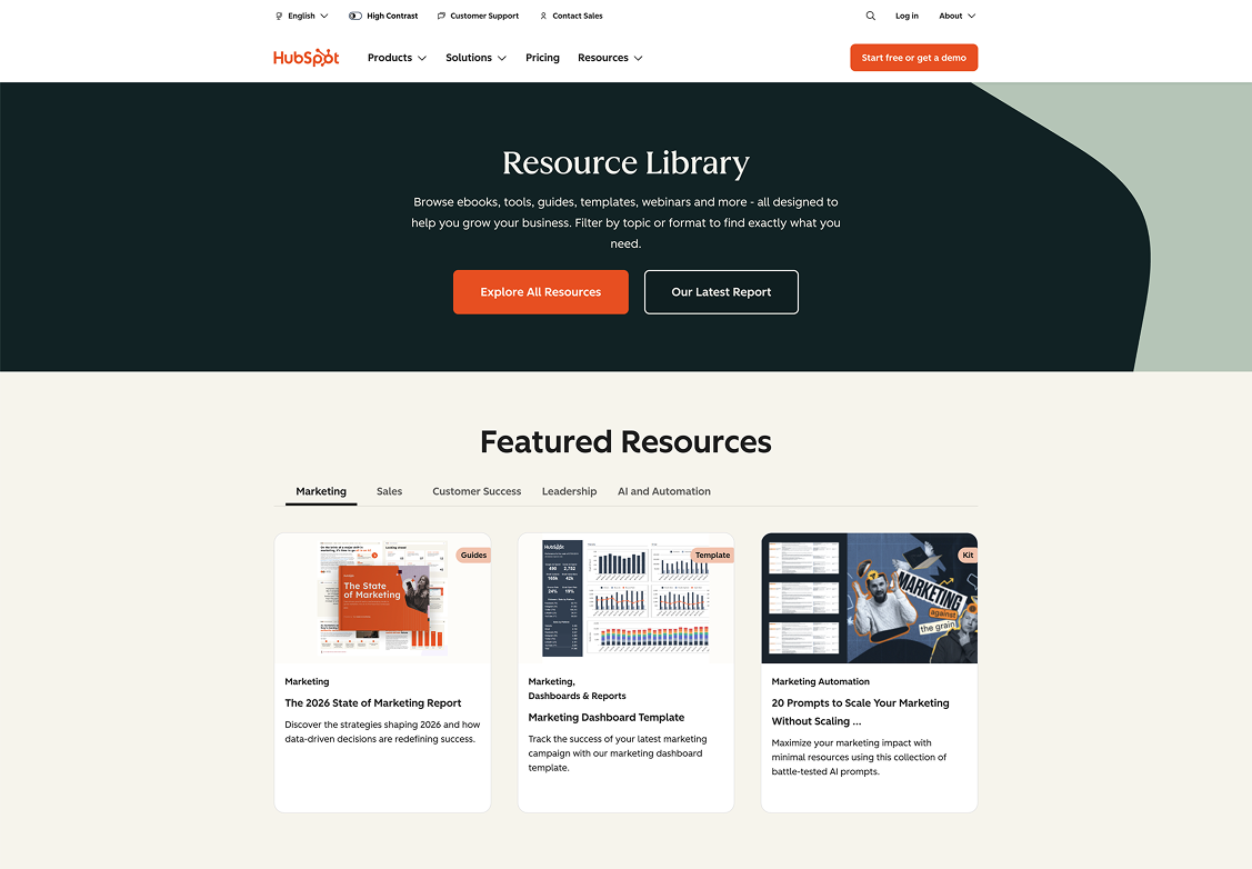
Strategic Featured Resources
Many high-performing resource libraries highlight featured content at the top of the page.
This is not random. It is intentional prioritization.
Featured resources often include:
- High-performing evergreen guides
- Newly launched research reports
- Strategic lead magnets
- Content tied to current campaigns
The feature area acts as a conversion lever. It directs attention before users enter the broader content grid.
Without featured content, every asset competes equally. With featured content, you control visibility and business impact.
More examples below:
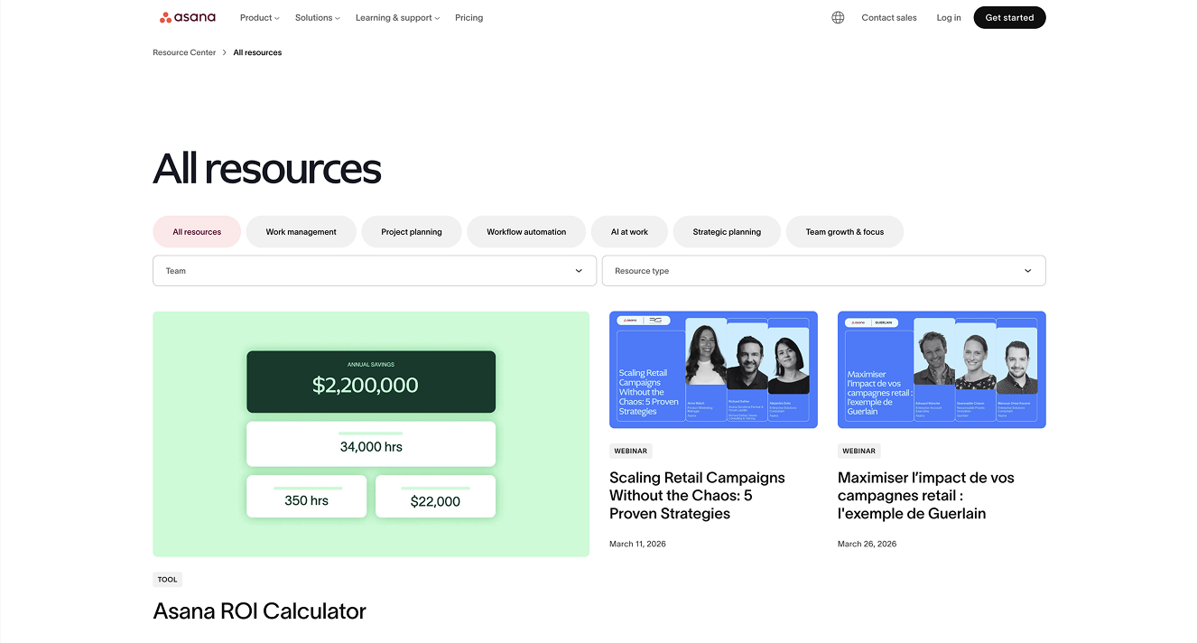
Robust Filters on “All Resources” Pages
When users land on an “All Resources” page, expectations change.
At this point, they are in exploration mode. This is where strong filtering and sorting become essential.
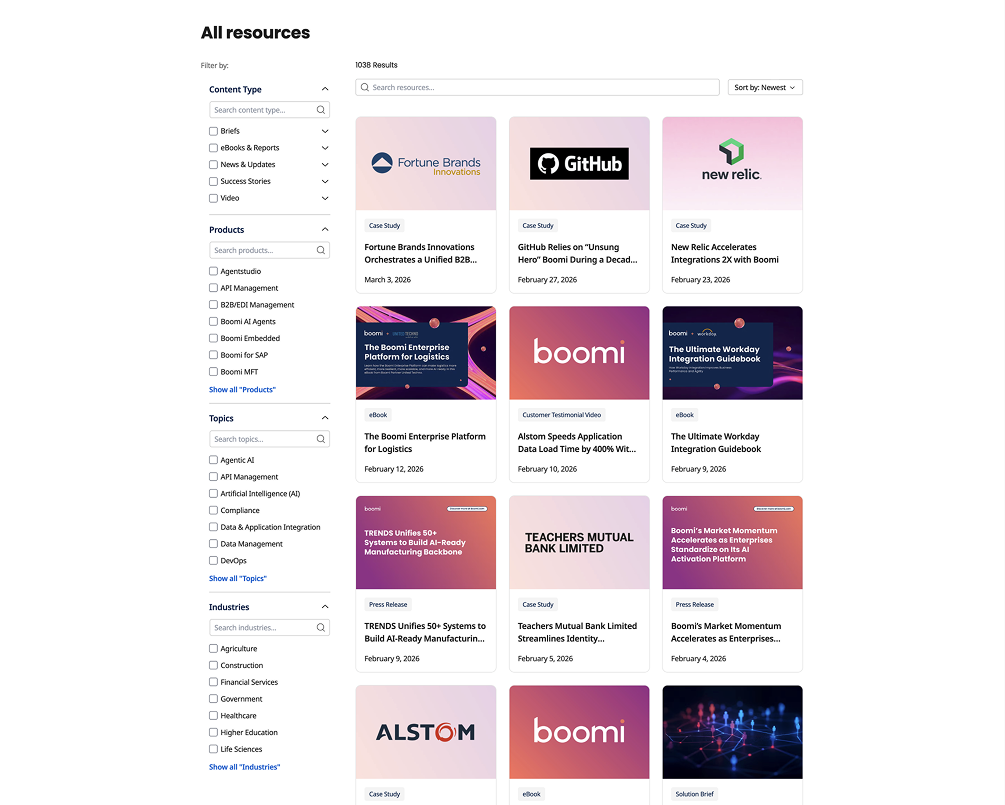
The most common filter categories across brands include:
- Product
- Team or audience
- Resource type or format
- Content topic
- Industry
Many also include sorting options such as most recent, most popular, or alphabetical. Search functionality is standard.
The deeper the library, the more critical these filters become. Once you cross 30 to 40 assets, a simple grid without filters becomes overwhelming.
From a CRO perspective, filters reduce friction. From an SEO perspective, they strengthen internal linking and topical clustering.
More examples below:
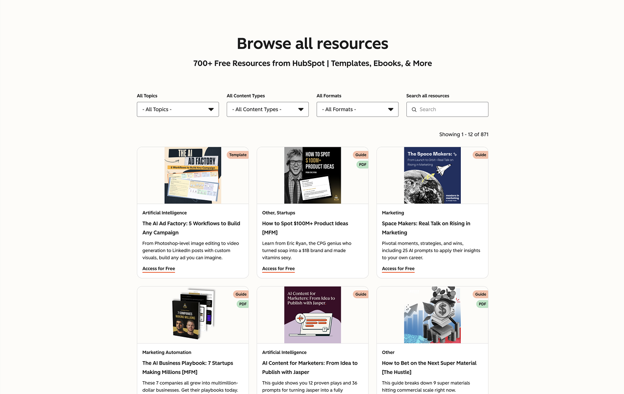
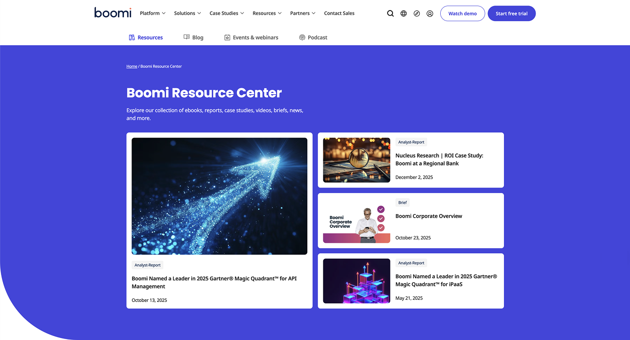
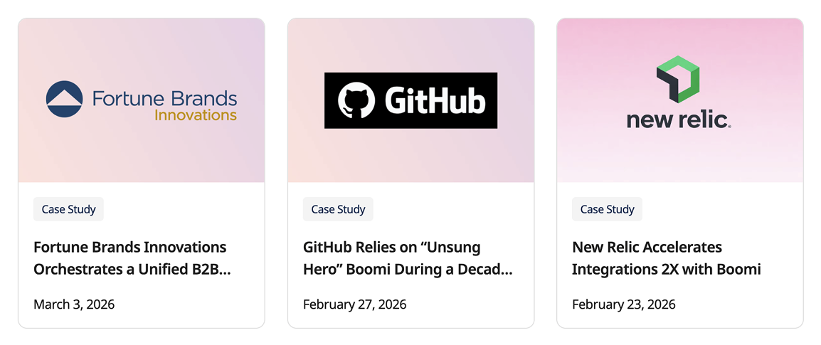
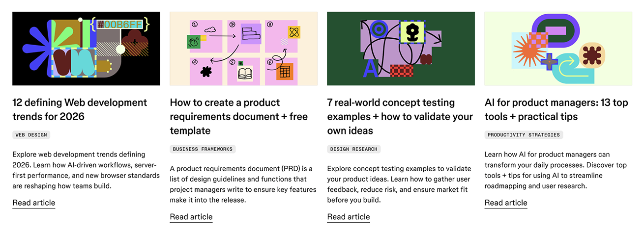
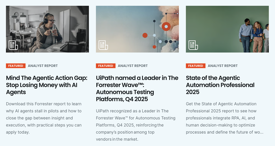
Resource Tiles: What Information Is Typically Included
When you examine individual content cards across brands, a pattern emerges.
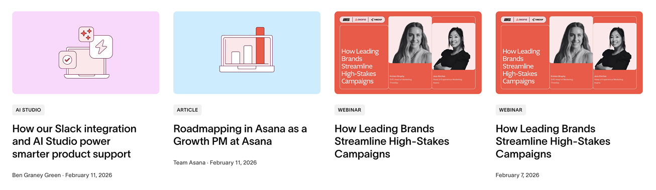
Using Asana as an example, most resource tiles include:
- A thumbnail image
- A resource type tag
- Title
- Author and publication date
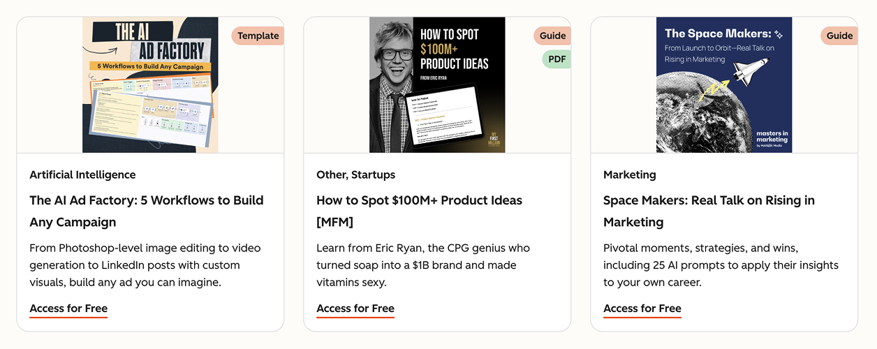
HubSpot takes this slightly further. Their tiles often include:
- A PDF label when relevant
- A topic tag
- A short description
- A clear CTA such as “Access for Free”
This is a small but important detail. Micro copy on tiles can significantly impact click-through rate. Clear labeling also sets expectations around format and value.
If your resource grid lacks clarity at the card level, engagement will suffer regardless of how strong the overall structure is.
More examples below:
Bottom-of-Page CTAs and Support Banners
Most resource libraries do not end with content.
They end with a support banner or CTA section.
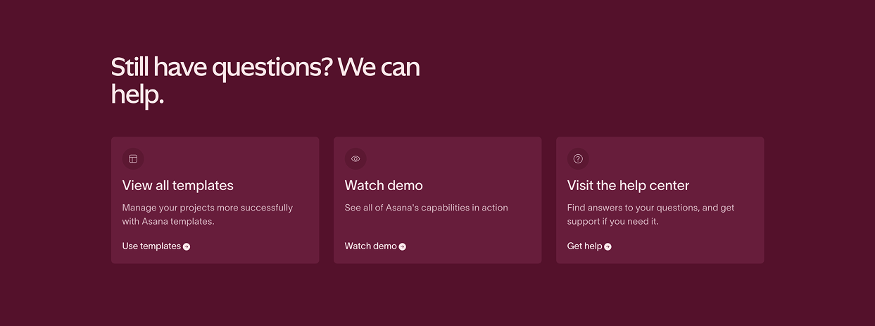
This typically promotes:
- A product demo
- A strategy session
- A free consultation
- A newsletter subscription
- Customer support services
This is a logical transition. After consuming educational content, users are primed for next steps.
If your library ends abruptly without a strategic call to action, you are missing a conversion opportunity.
More examples below:


What These Benchmarks Tell Us
Across different industries and business models, high-performing resource libraries share common traits:
- Clear categorization at the top of the page
- Robust filtering and search that sort resources by product, topic, type, and audience
- Strategic audience or department segmentation when relevant
- Featured content to guide attention
- Informative and well-labeled resource tiles
The visuals may differ, but the structure is intentional.
The lesson is not to copy another brand’s design. It is to understand the architectural principles behind it.
Structure drives discoverability. Discoverability drives engagement. Engagement drives conversion.
If your current resource page feels more like an archive than a strategic asset, it is likely missing one or more of these elements.
Final Thoughts
A resources library page is not about organizing content for the sake of organization.
It is about turning your expertise into a structured, searchable, conversion-focused ecosystem.
If you are investing in content but not seeing measurable returns, the issue may not be volume. It may be architecture.
And architecture is strategic.
If you want help designing or optimizing your resource library for traffic and conversions, book a free consultation with our team. We will review your structure, SEO alignment, and conversion pathways and provide practical next steps.
Book a Free Website Consultation
Discover quick wins for your digital strategy. 100% guaranteed.