



About the Project:
Tanga is an online business offering a personalized, human-centered shopping experience for people who are tired of large, impersonal marketplaces. As a small business themselves, Tanga is dedicated to supporting other small businesses while helping customers find great deals without sacrificing quality or service. With rock-bottom pricing, fast shipping, and a straightforward checkout process, Tanga has built a loyal base of savvy shoppers, many of whom sign up for their newsletter and loyalty program to save even more.
Tanga partnered with KARL Mission to uncover where friction was holding back conversions across the site and to build a structured, data-driven testing program to fix it.
Mission:
Our mission was to:
- Conduct a comprehensive CRO audit of Tanga's website.
- Increase conversions across key pages and user flows.
- Optimize the site through ongoing, data-backed A/B testing.
Process:
1. Briefing: We began by aligning with the Tanga team on business goals, priority pages, and key conversion metrics, making sure every test we ran would tie back to a measurable business outcome.
2. CRO Audit: We conducted a deep analysis using Google Analytics, Hotjar, and Glassbox to understand how users were actually behaving on the site, where they were dropping off, and what was creating friction in the purchase journey. We paired this with a competitor benchmark to see how Tanga's experience stacked up against other ecommerce sites. This audit resulted in a set of UX/UI recommendations and an A/B testing roadmap, prioritized by potential impact and ease of implementation.

3. A/B Testing: For each test on the roadmap, we developed a clear hypothesis grounded in the audit findings, then designed the test and its variants. We set each test up in Google Optimize, ran it until it reached statistical significance, and closely monitored performance throughout. Once a test concluded, we reported on the results and used those learnings to inform the next test, building an ongoing, iterative optimization process rather than a one-off engagement.
Solution:
Below are a few highlights from the A/B testing program.
Repositioning Product Reviews
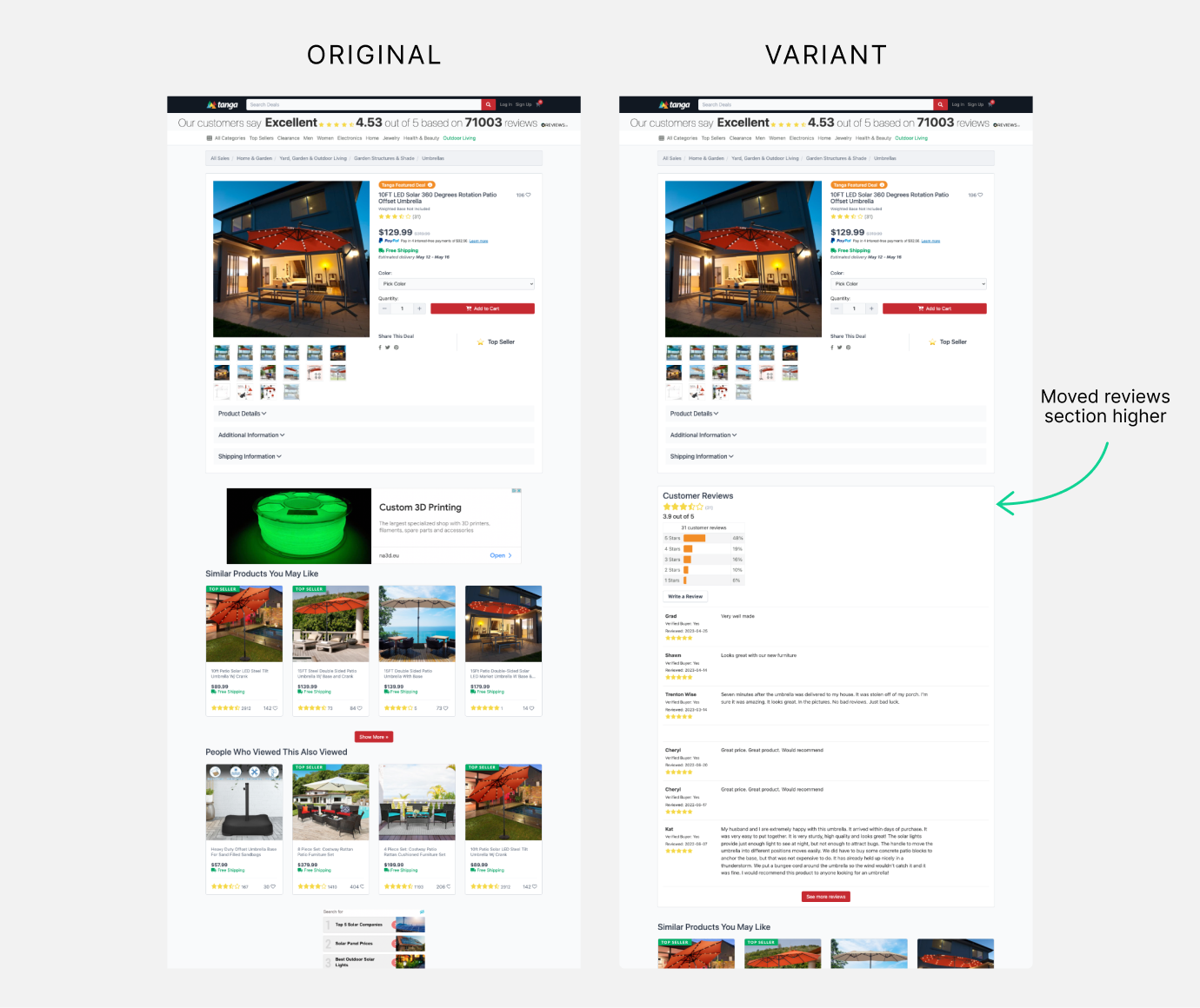
This experiment tested moving the customer reviews section higher up the product page to build trust earlier in the purchase journey. We compared a control group, where reviews stayed in their original position, against a variation where the section was relocated, measuring the effect on purchase revenue, purchases, and Add to Cart clicks.
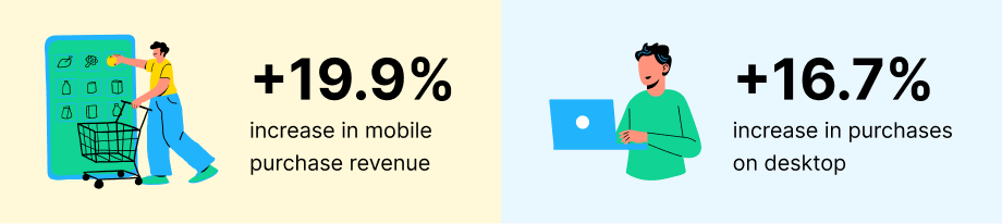
- Mobile results: Purchase revenue +19.89%, Purchases +8.68%, Add to Cart clicks +1.01%
- Desktop results: Purchase revenue +2.41%, Purchases +16.67%, Add to Cart clicks +5.26%
Streamlining the Mobile Product Page Layout
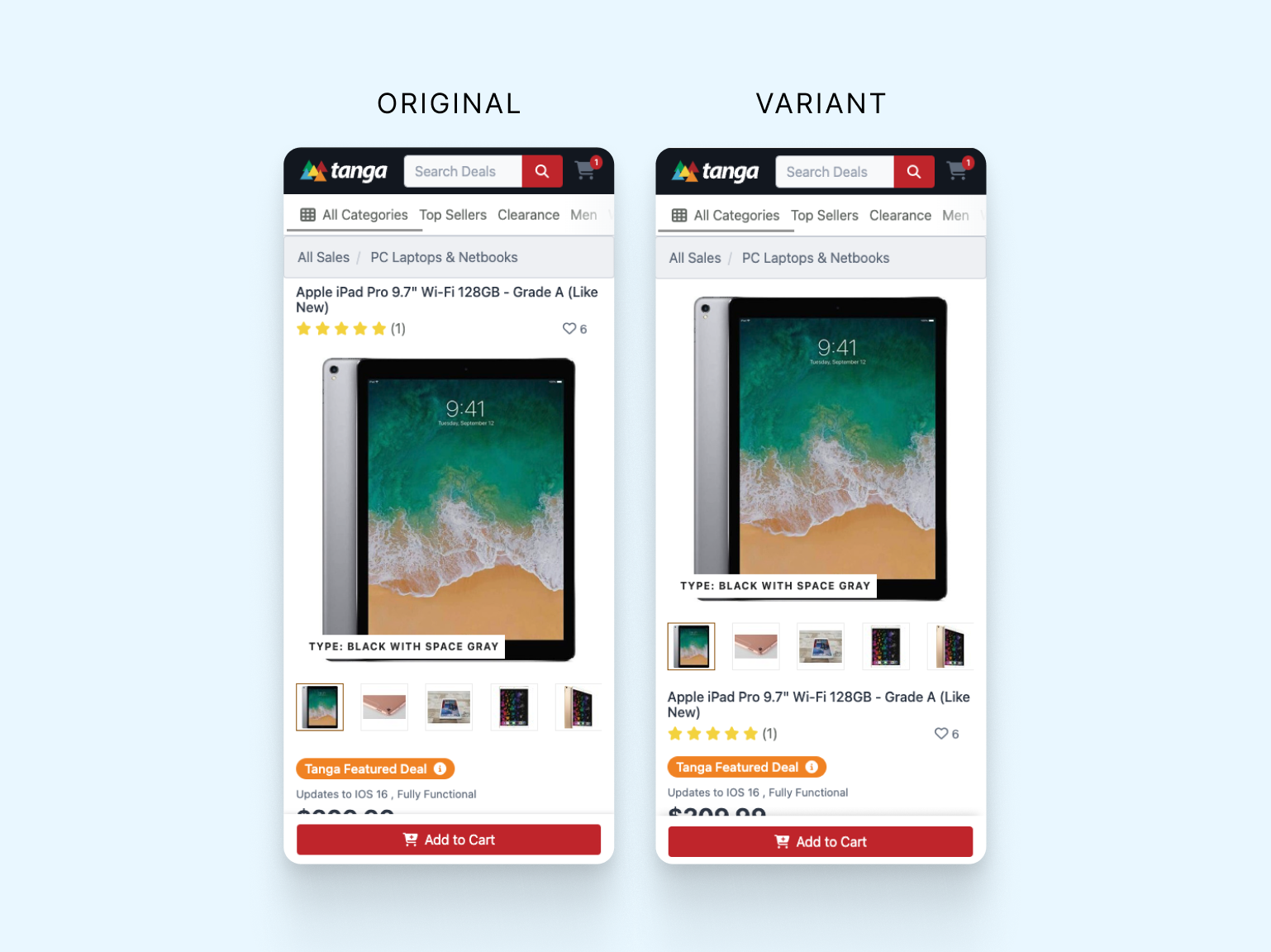
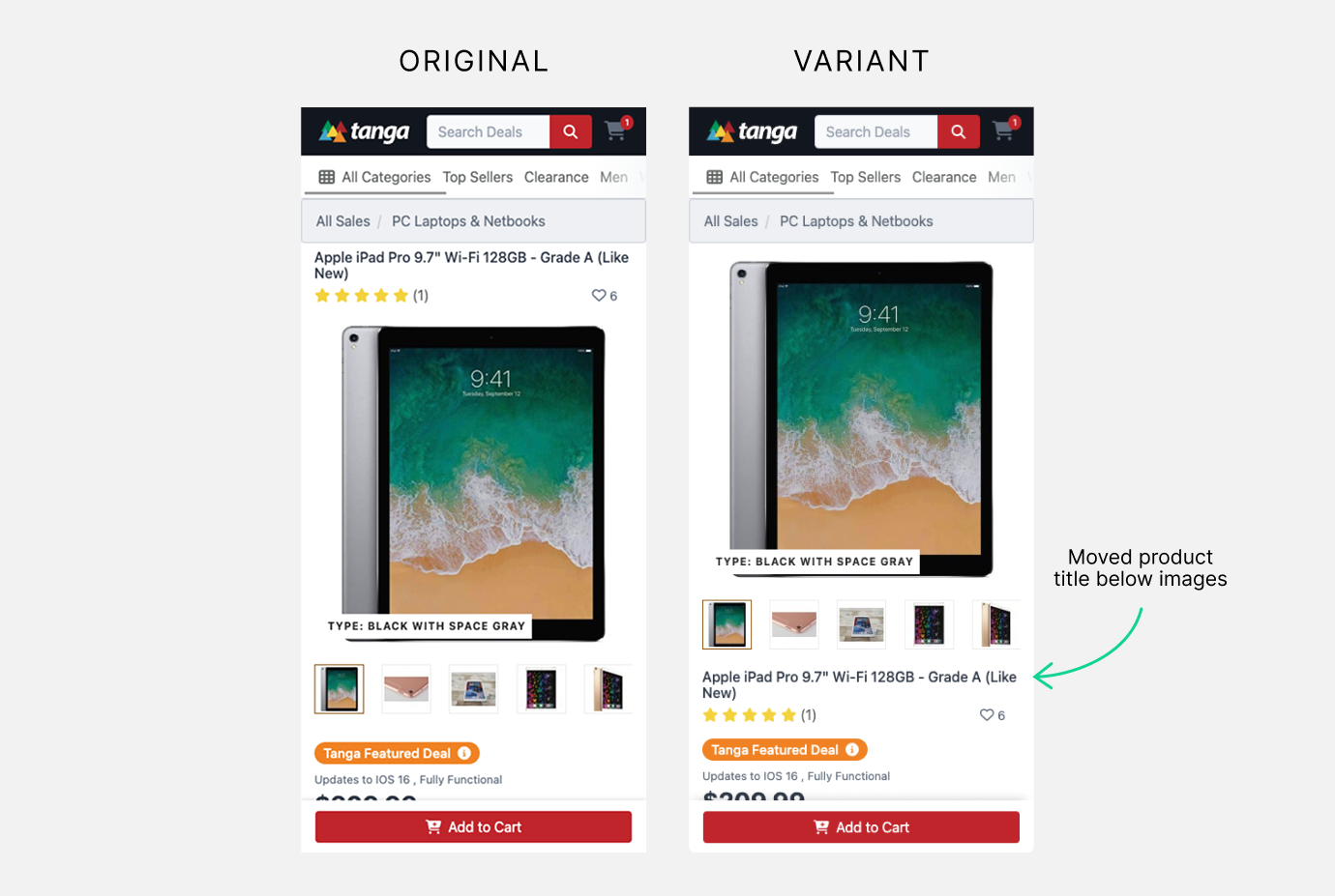
This experiment moved the product title below the product images on mobile. Based on research showing that users primarily interact with images first, we hypothesized that this layout would create a clearer product focus and improve engagement. We compared a control, with the title above the images, against a variation with the title moved below, measuring user engagement, time on page, and conversion rates.
- Mobile results: Purchases +1.23%, Add to Cart clicks +5.68%
Optimizing the Categories Navigation
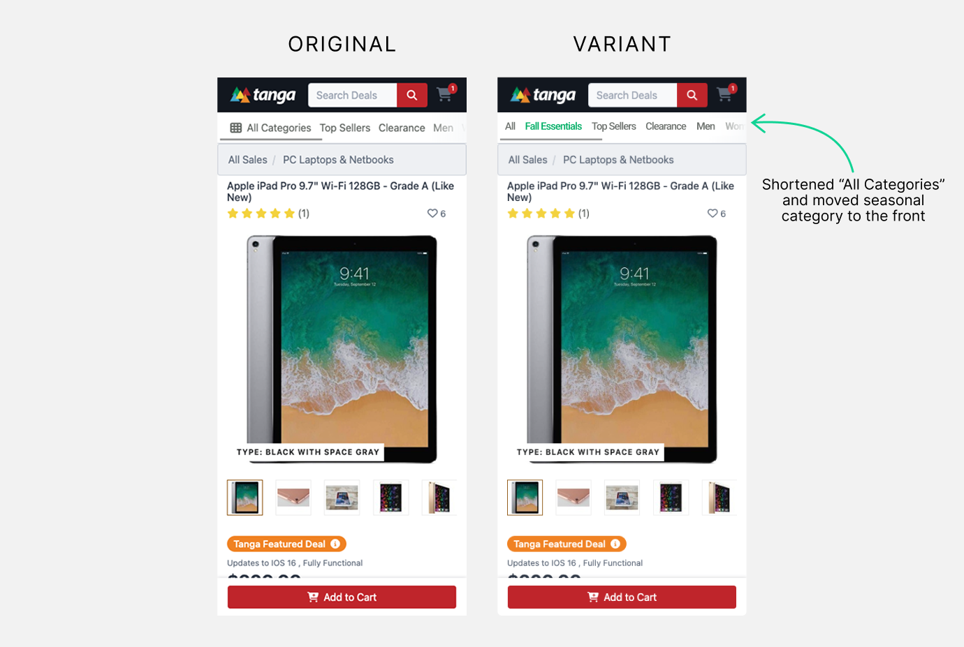
This experiment focused on the categories navigation bar on desktop. Google Analytics data showed that Top Sellers and Clearance categories already received substantial traffic, so we tested highlighting the seasonal category and adding icons to the top three categories to improve visibility and user friendliness. On mobile, we also shortened "All Categories" to "All" and removed the icon so more categories could be displayed at once.
- Desktop results: Purchase revenue +15.88%, Purchases +8.06%, Seasonal Category clicks +32.81%
- Mobile results: Purchase revenue +1.20%, Purchases +1.34%, Seasonal Category clicks +240%
Additional CRO Audit Recommendations
Beyond the tests above, the CRO audit surfaced a broader set of UX/UI recommendations to further reduce friction across the shopping experience.
Product Tile Design
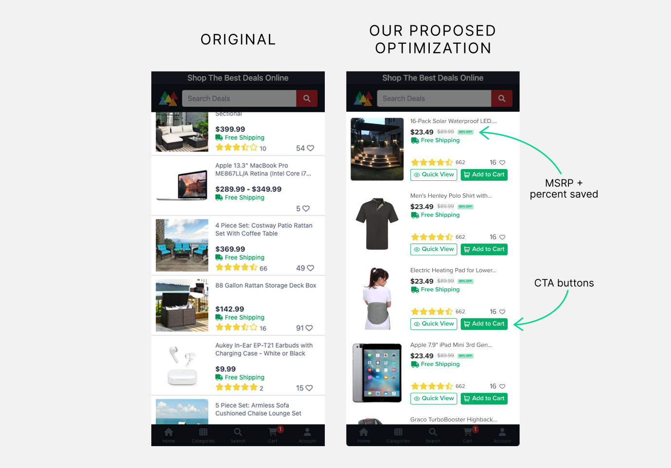
- Added an Add to Cart button directly to each product listing, letting shoppers purchase without leaving the browsing view.
- Added a Quick View button to each listing for faster product exploration.
- Displayed the MSRP crossed out alongside the percent saved, reinforcing Tanga's value proposition at a glance.
Quick View Pop-Up Window
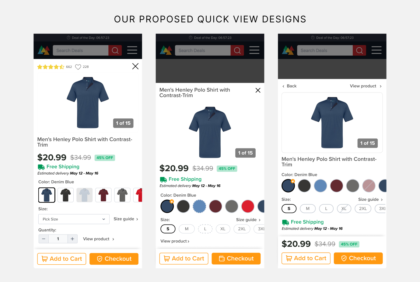
- Designed a Quick View experience that lets shoppers view key item details without navigating away from the product listing page, reducing drop-off during browsing.
Product Page
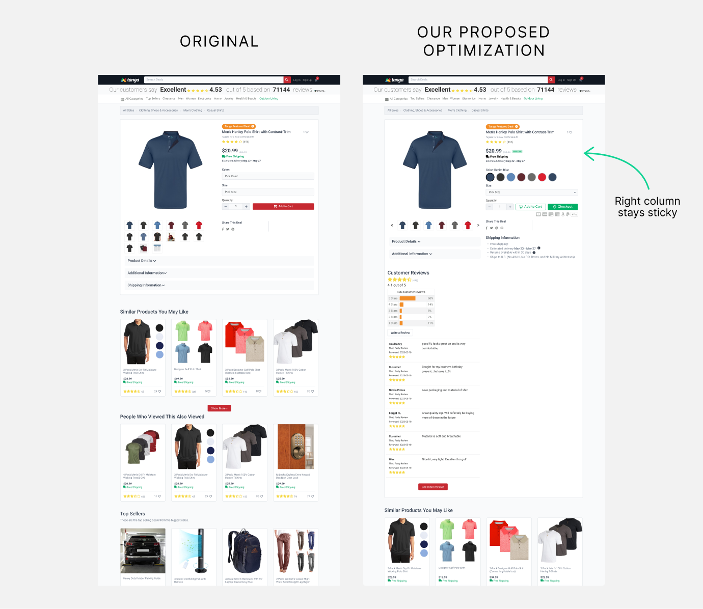
- Made the key details panel, including the Add to Cart button, color selection, size selection, and quantity, sticky in the right-hand column so it stays visible as shoppers scroll.
Search Bar Suggestions
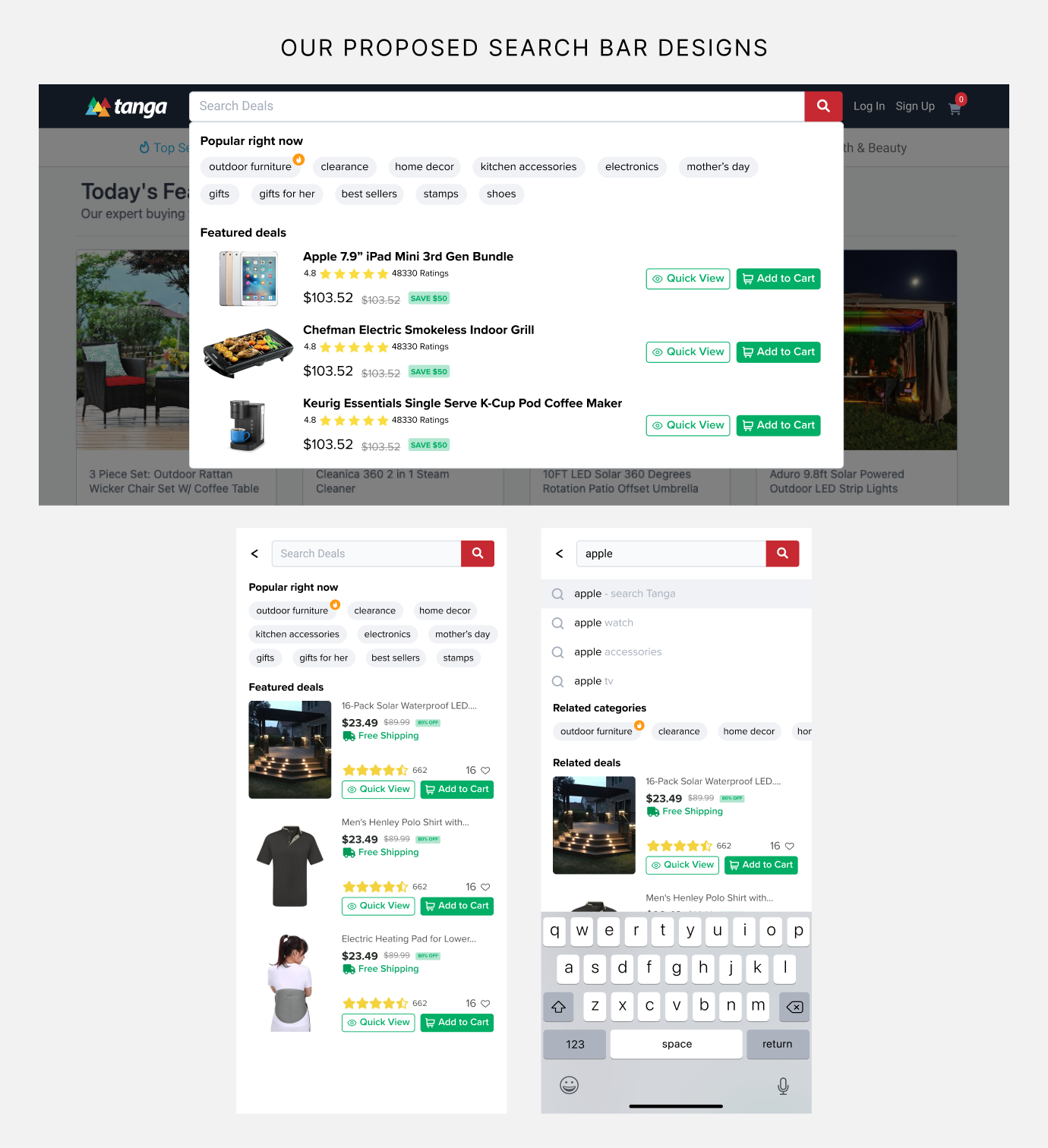
- Recommended adding search suggestions directly into the search bar, including a "Popular Right Now" section with trending search terms, featured deals, and suggested terms related to what the user is typing.
Results:
Through a structured program of CRO audits and iterative A/B testing, Tanga saw measurable gains across purchase revenue, purchase volume, and engagement on both mobile and desktop. Each test built on insights from the last, giving Tanga a repeatable, data-driven process for continuing to optimize their site well beyond this engagement.
Ready to Turn Website Traffic Into Real Growth?
If you're ready to stop guessing and start testing, we can help you build a CRO and A/B testing program that turns insights into measurable results. Book a free consultation to get started.
Book a Free Website Consultation
Discover quick wins for your digital strategy. 100% guaranteed.